Sedona S.R.L
Sedona S.R.L — hardware supplies distributor
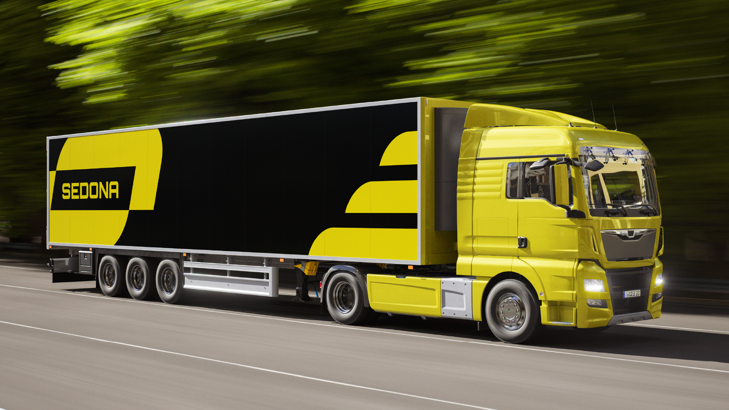
The piece that launched the brand wasn't a guidelines document. It was a semi-trailer on the motorway.
The brief
Sedona S.R.L is a hardware supplies distributor founded by a friend and his brothers.
He got in touch just as they were about to launch: they needed the brand built from scratch. No prior identity, no pieces, no established name — just a company about to open its doors.
The brief had exactly one constraint: the mark had to read as an S.

The idea
The only requirement was that the brand combine a mark and a logotype, and that the mark read as an "S". Researching logistics and distribution companies, I found two constants in the sector: sans serif type and a palette dominated by yellow, grey and black.
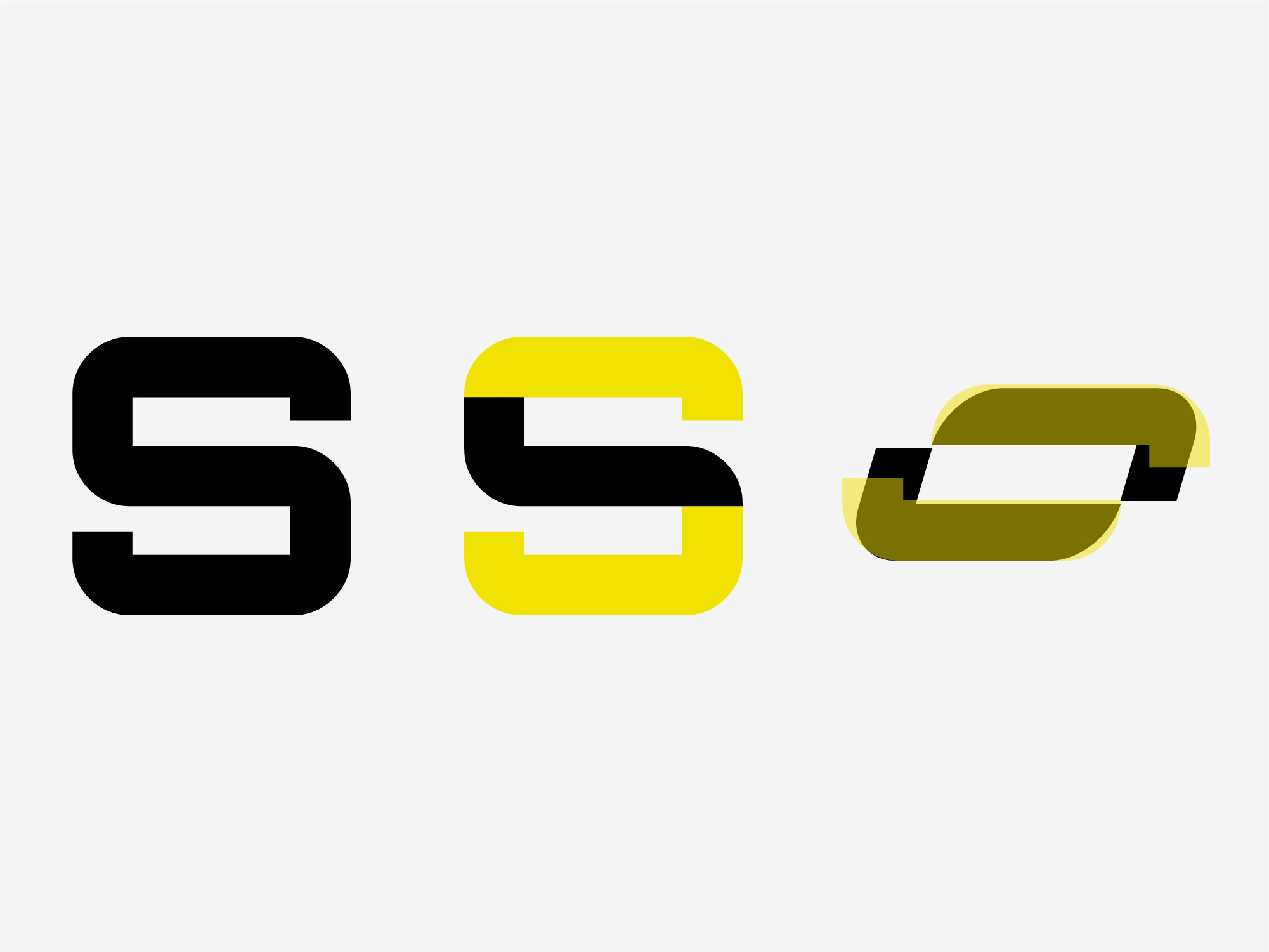
After a lot of sketching, the solution came from intervening the "S" of the chosen typeface itself — cutting its vertical strokes and reordering them so it still read as an S, but with a character of its own.
The solution came from intervening the S of the typeface itself.
Development
The mark was resolved by subtraction: cut and reorder rather than draw from zero. That kept the brand inside the codes of the sector without looking like its competitors.
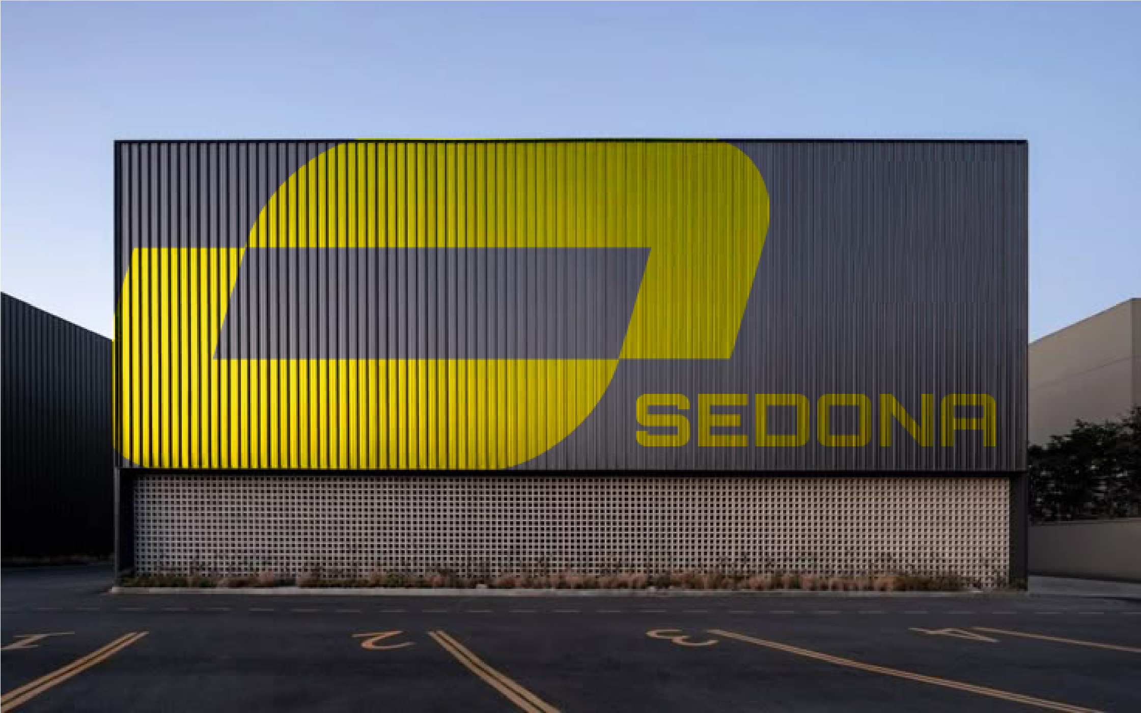
The guidelines fixed minimum sizes, the relationship between mark and logotype, and its behaviour on dark backgrounds — the most frequent case, since it lives on truck panels and signage.
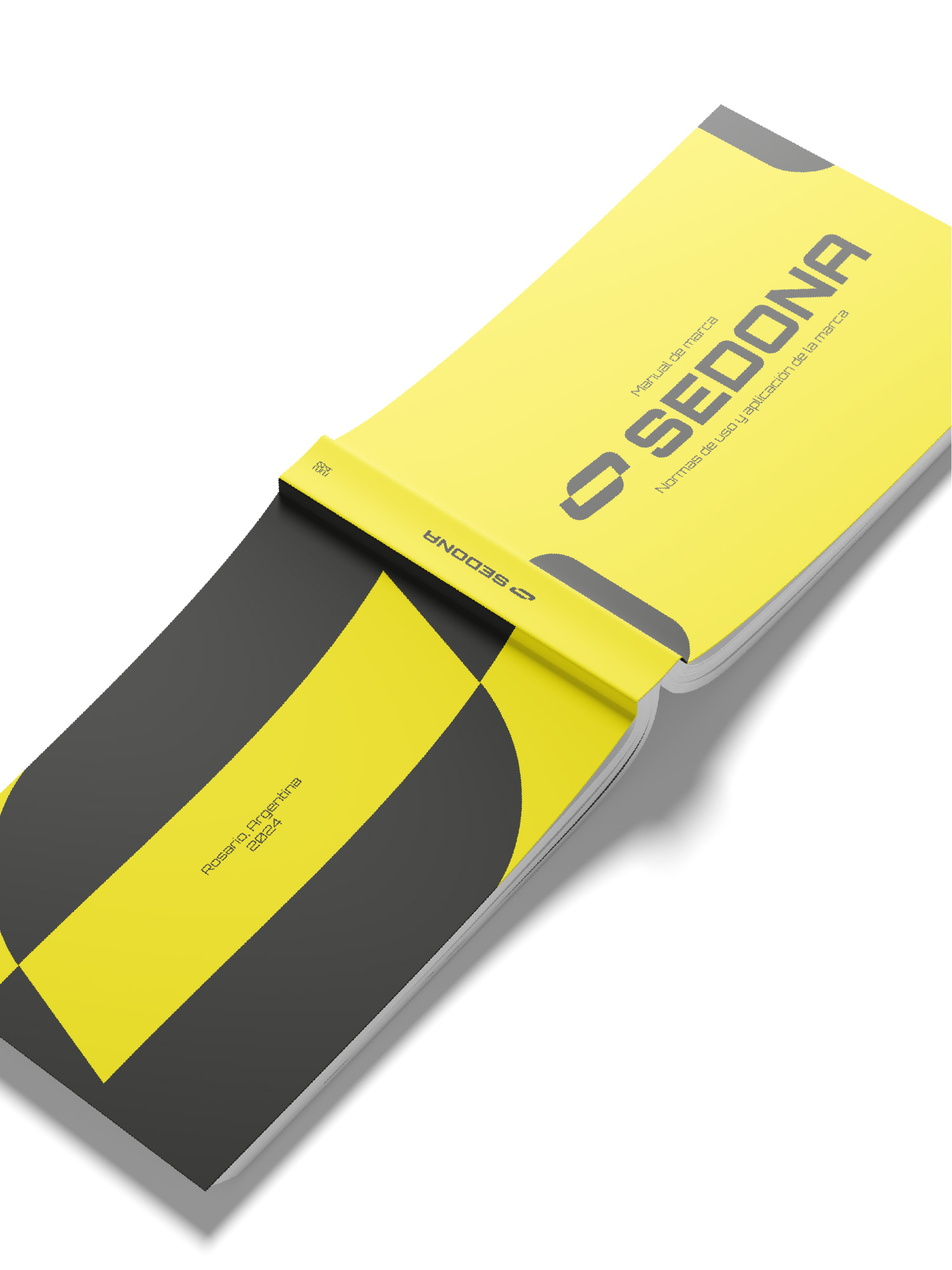
One type weight across the whole brand. On sheet metal and cut vinyl, thin strokes don't survive.
Applications
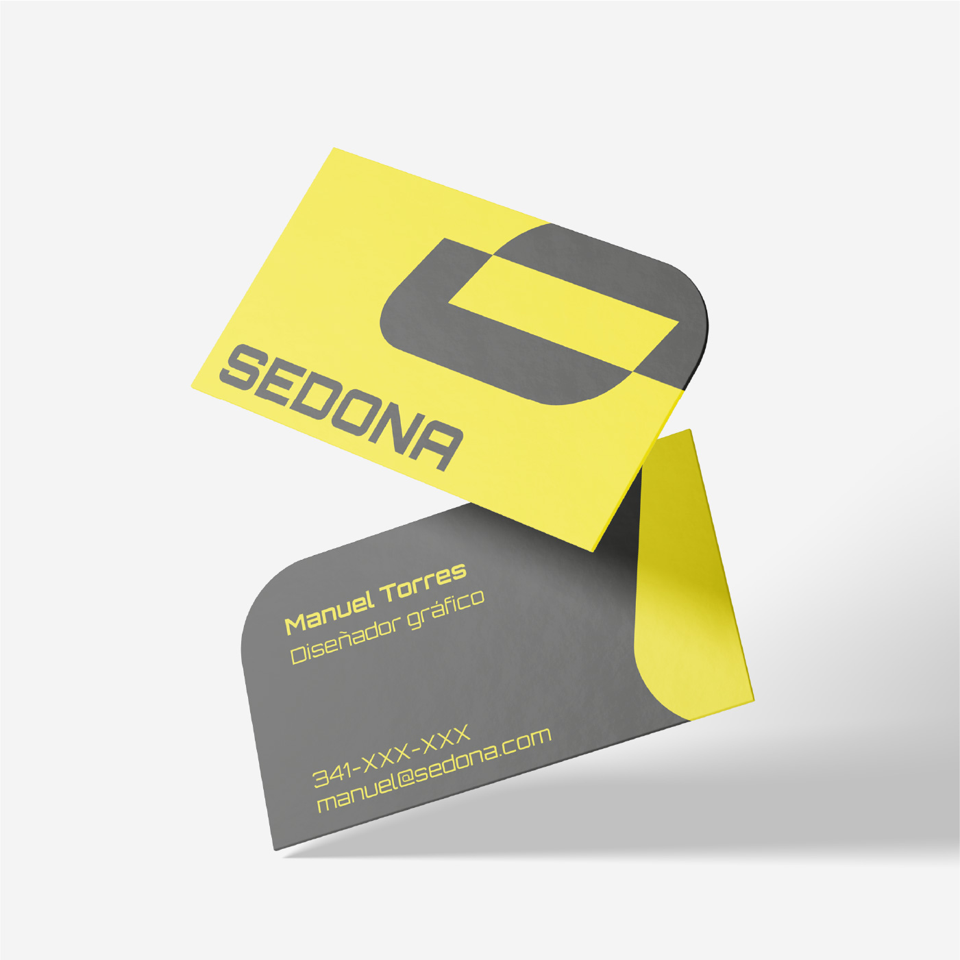
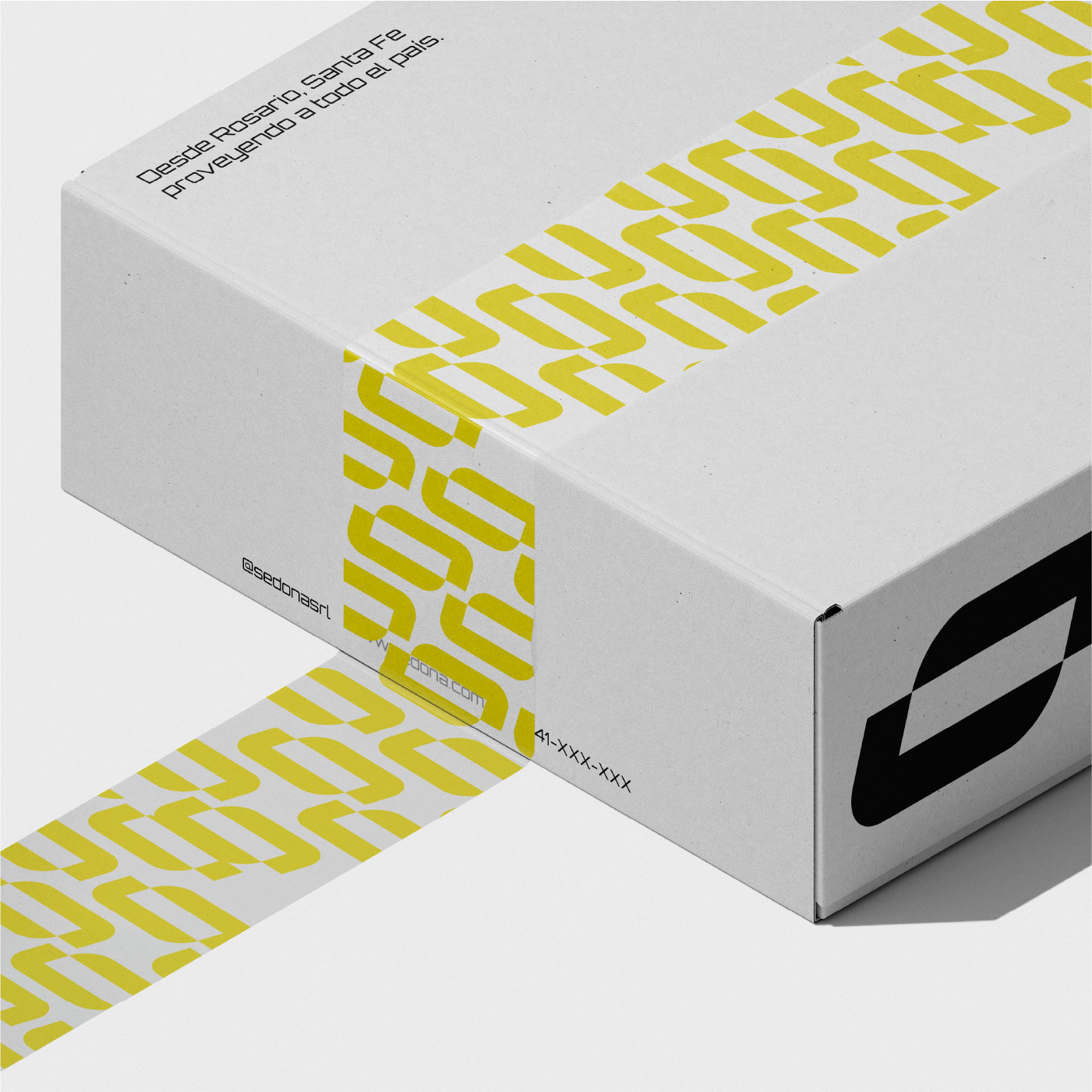
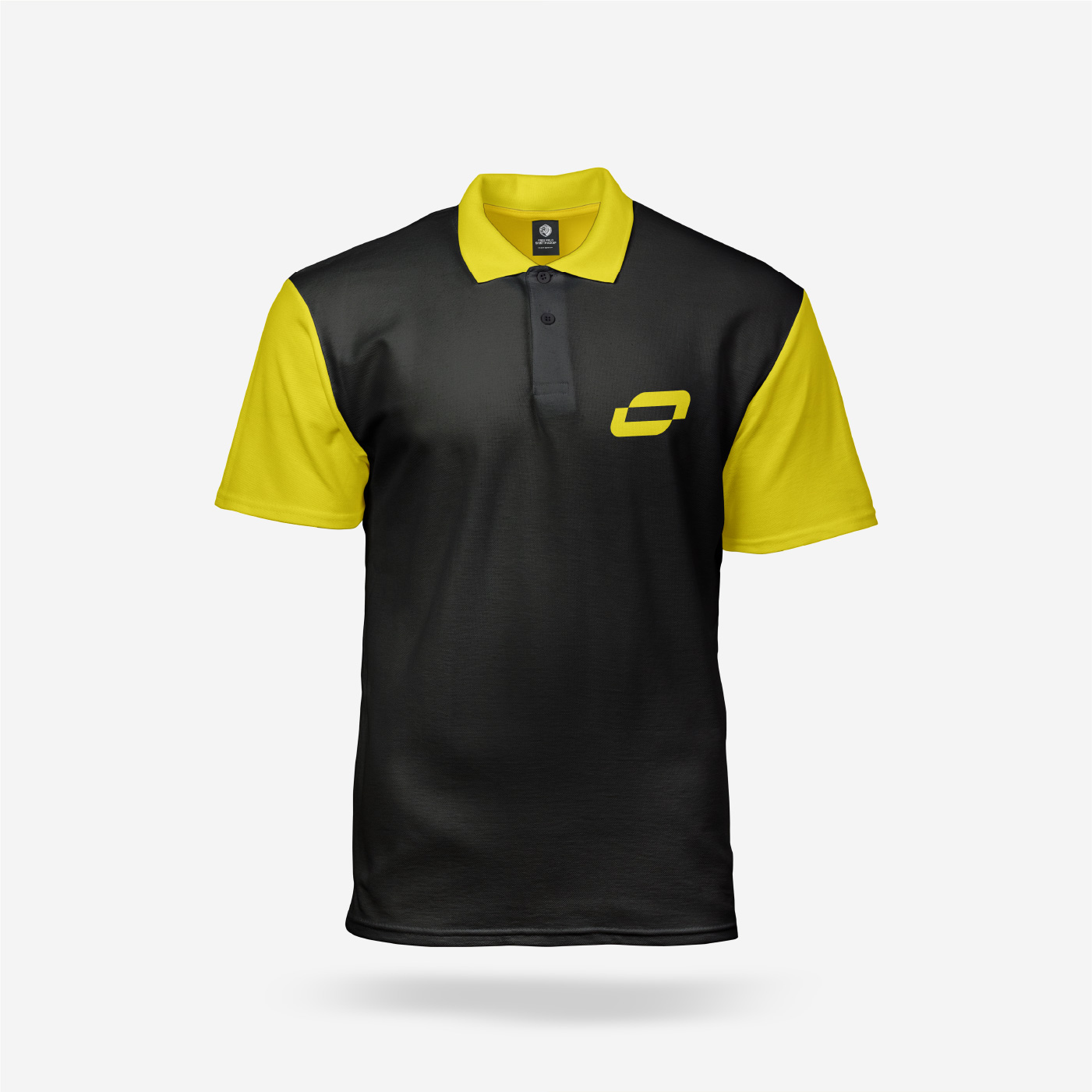
A company just starting out needs few pieces, done well: the one seen on the street, the one handed over in person, and the one that arrives with the delivery.
Outcome
Sometimes the most specific constraint is the one that opens the clearest path.
Working with a constraint that concrete — the mark had to read as an S — turned out to be what triggered the solution. It was also the first project I saw implemented: the brand existed on the street before it existed in a guidelines document.