FISFE
Santa Fe Industrial Federation — rebrand competition

Gear teeth above, ploughed furrows below. Industry and agriculture in a single form.
The brief
FISFE ran an open competition to redesign its brand. The brief asked for an identity that represented the different productive sectors of Santa Fe province and its workforce, that kept the colours the brand already used, and that read as modern.
Beyond the redesign, entrants had to design the trophy the federation awards each year, and submit brand guidelines, applications, a written rationale and a landing page. I entered with Santiago and Sele.
The brief asked us to keep the colours. Modernity had to come from the form.
The idea
The core idea was to show the two great areas of Santa Fe's economy — industry and agriculture — in a single mark. We combined a gear wheel with a ploughed field, two forms that also share a circular logic running toward the centre. We kept the palette the brief required and chose a sans serif to meet the sense of modernity it asked for.
The hardest part was exactly that: representing two very different concepts inside one mark without it feeling forced.
A gear and a ploughed field share the same circular logic running toward the centre.
Development
Working as a team with Santiago and Sele was key to resolving that complexity. Three different readings helped us land the representations the competition asked for — much harder to solve alone.
Alongside the brand and its guidelines we developed the trophy design with its material specification, and the landing page the brief required. The competition demanded everything submitted together and defended in writing through a rationale document.
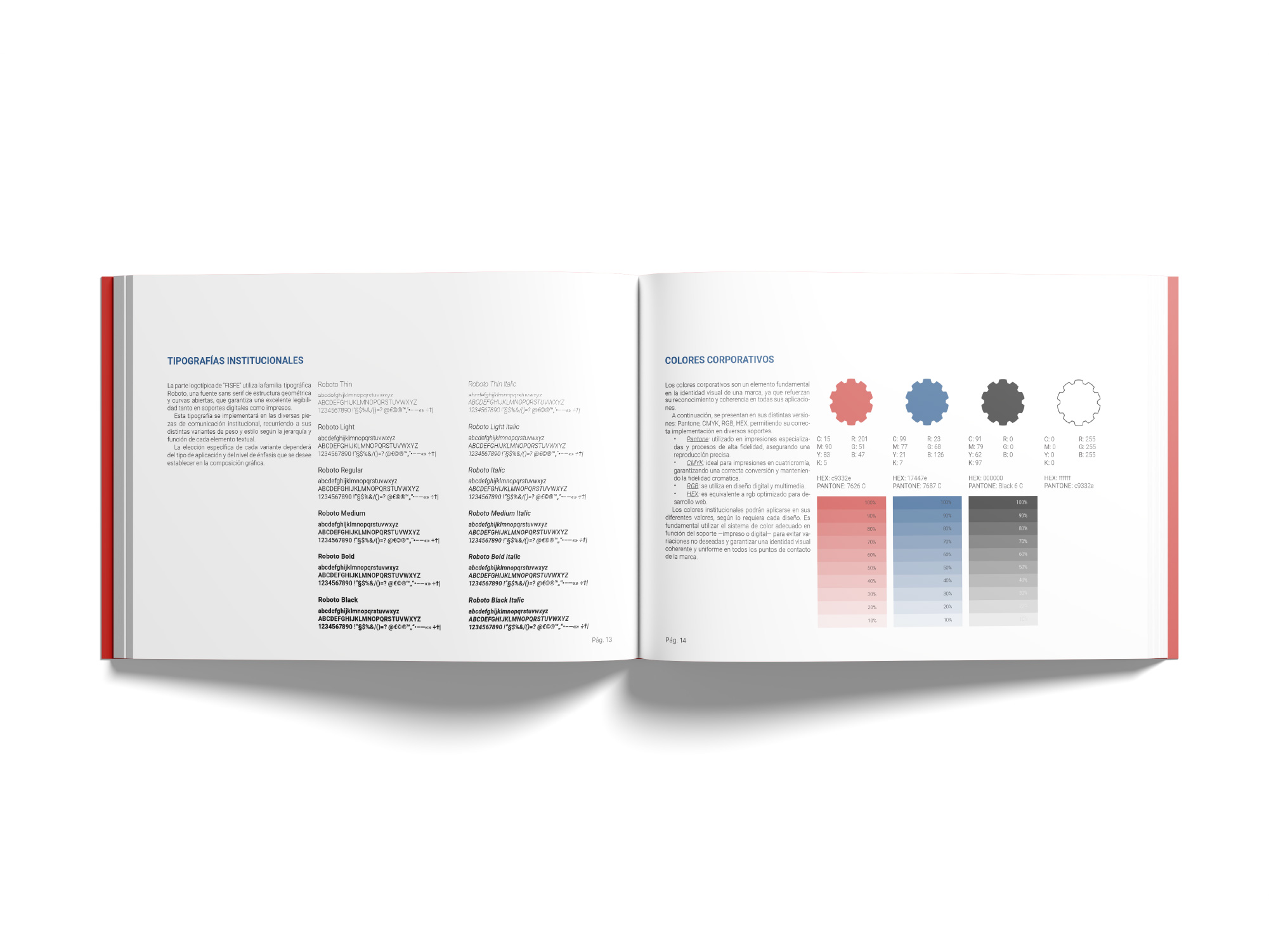
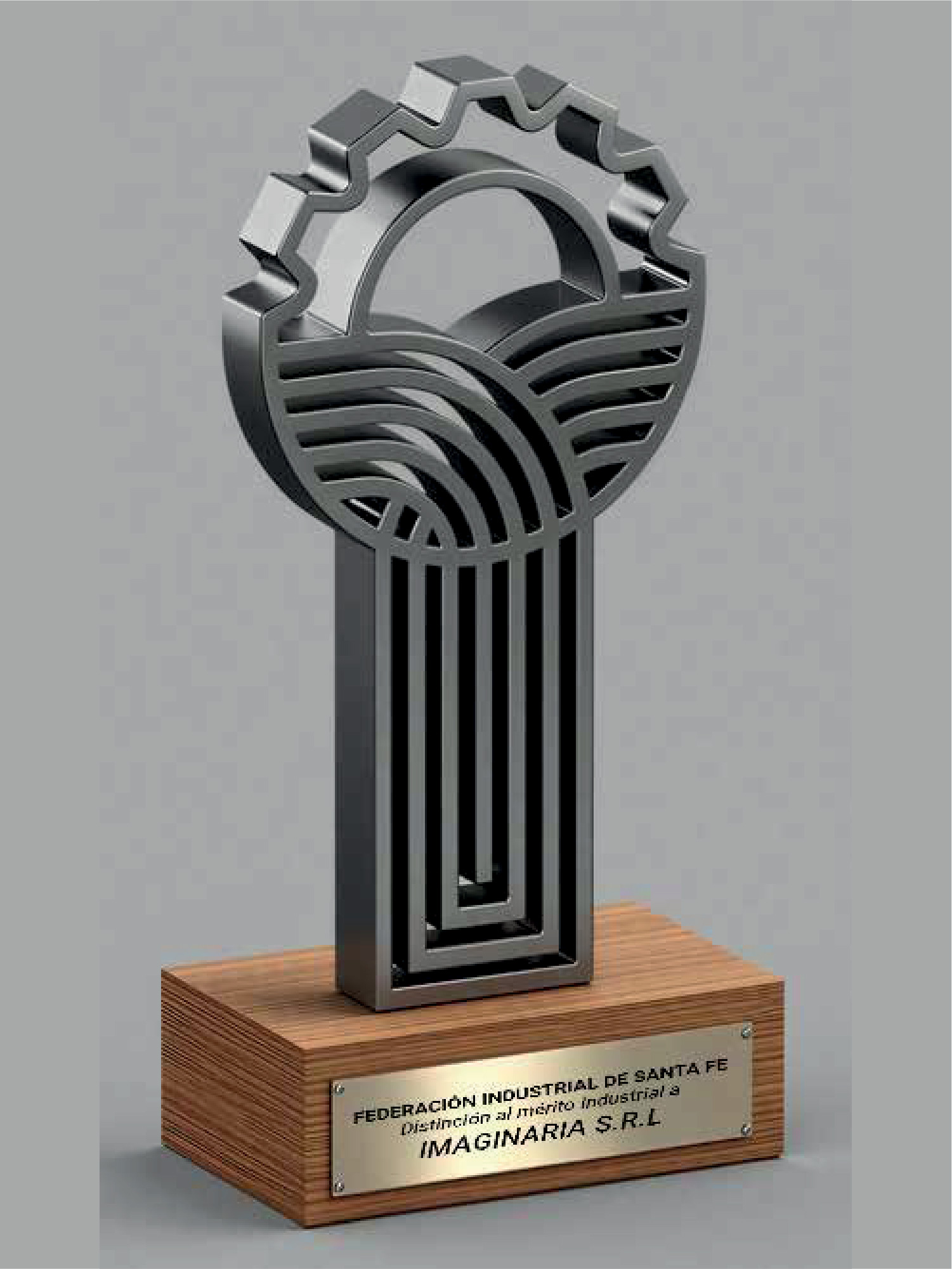
The mark holds up cut through. The trophy is the brand perforated, not the brand stuck onto an object.
Applications
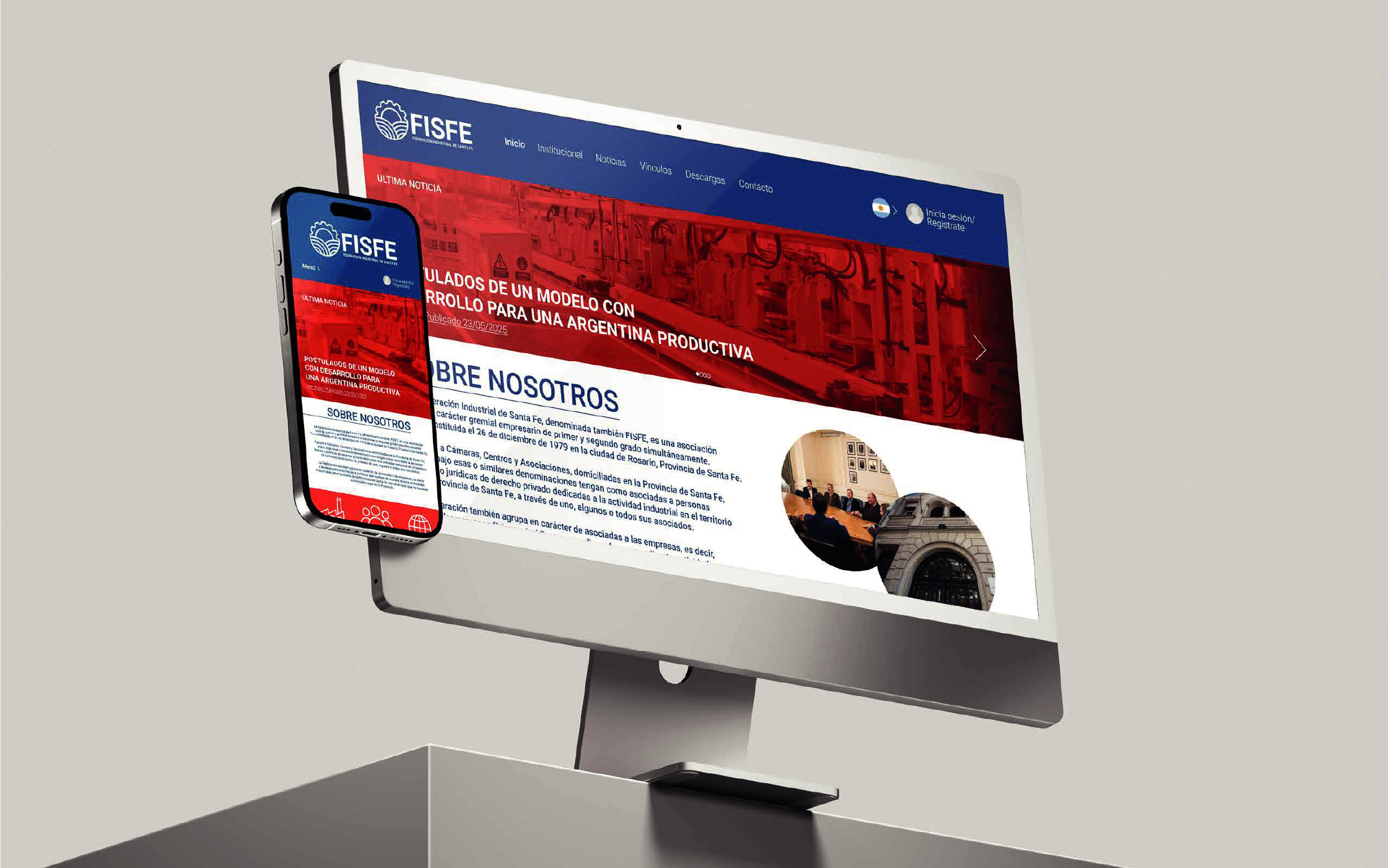
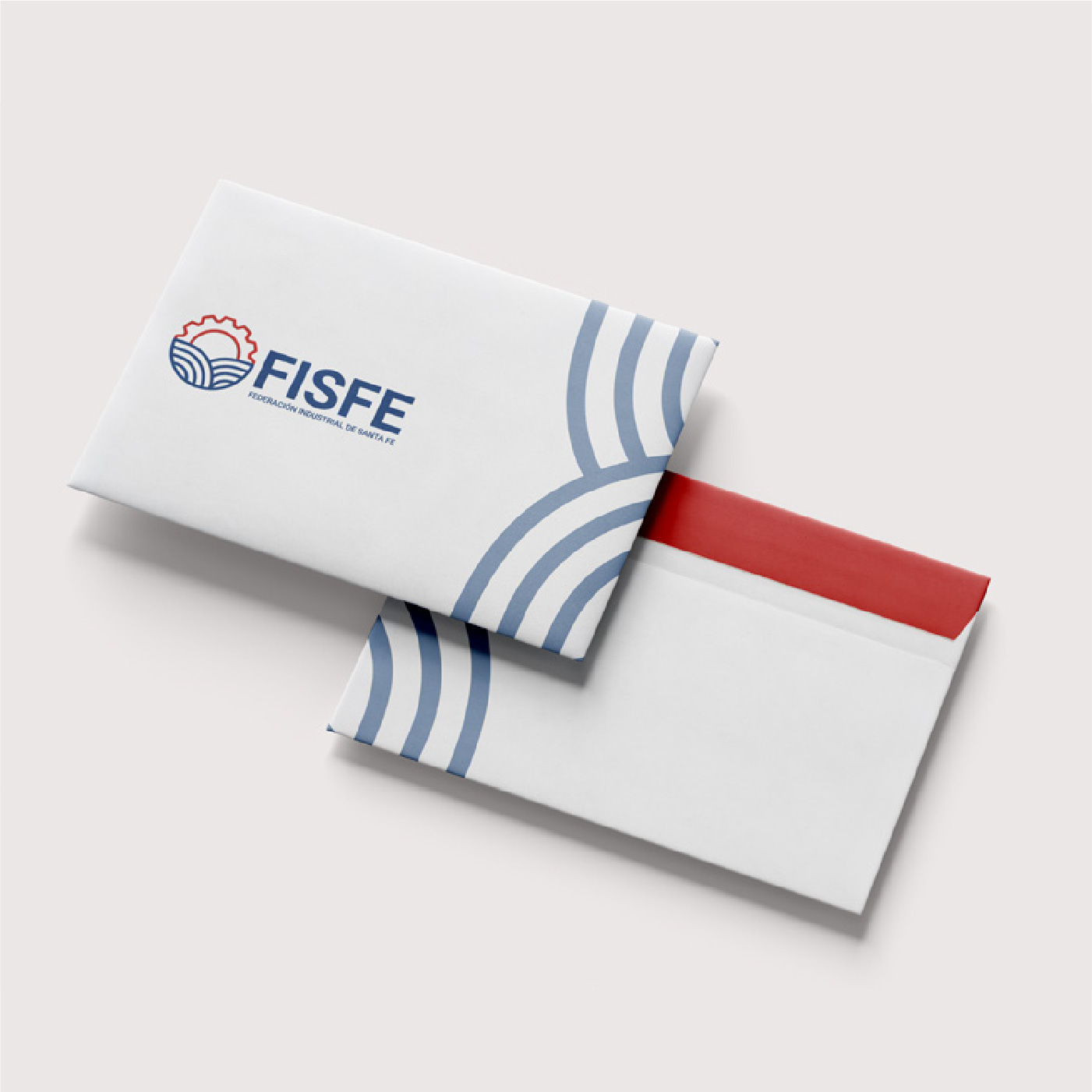
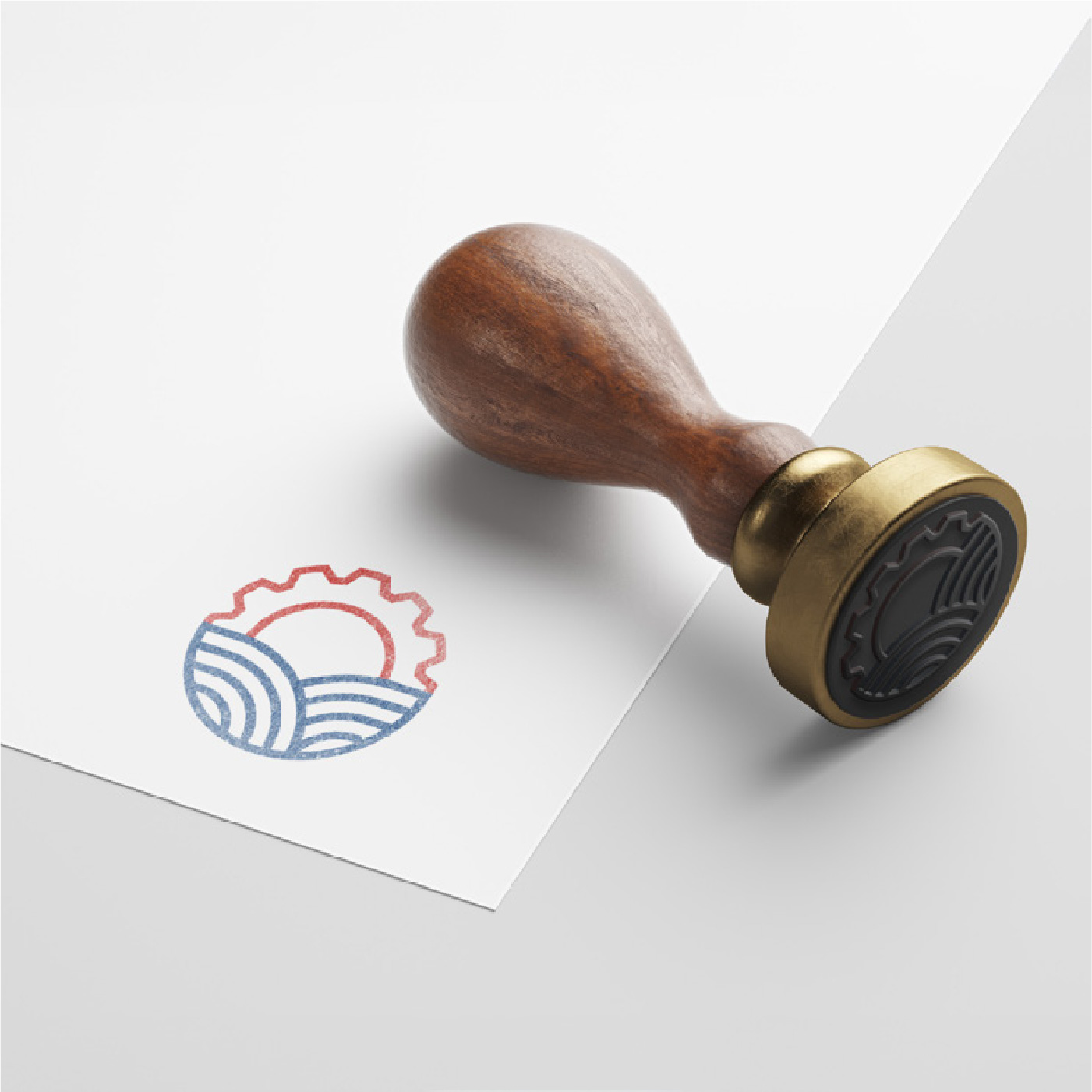
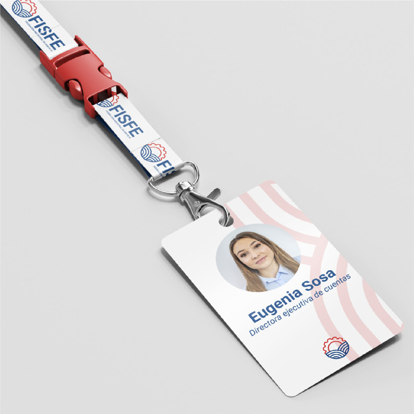
Of the eight applications in the brief, the three that survived prove different things: one printed, one embossed, one carried.
Outcome
Beyond the result, it's the work itself I take from this one.
It was the first time Santi, Sele and I entered a competition together. We went in with some insecurity and uncertainty, but also with real appetite and confidence. Delivering against a real set of requirements, with a written rationale and external deadlines, looks a lot less like a course and a lot more like the job.