Aquabar — River Club
Aquabar — university rebranding project
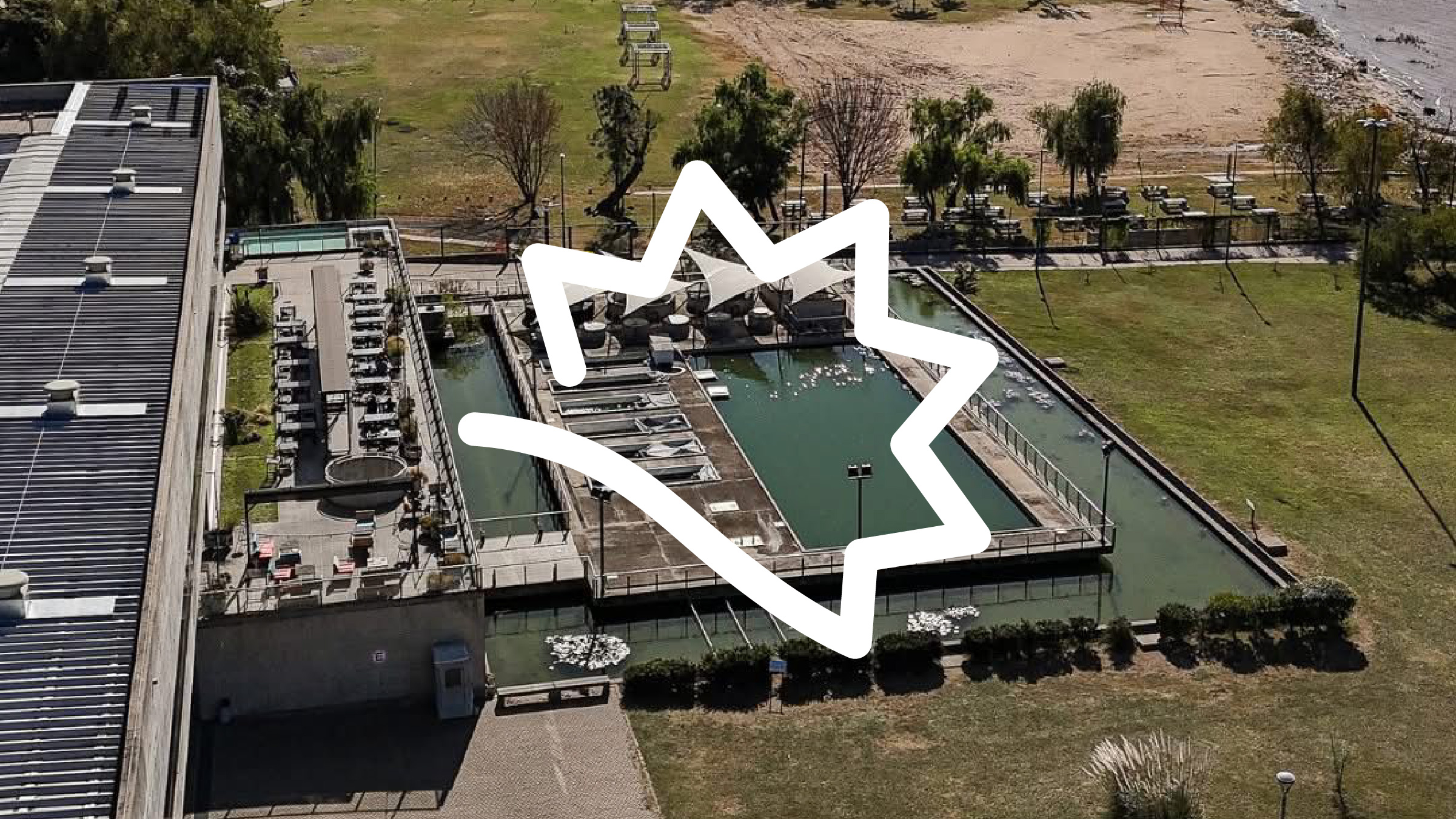
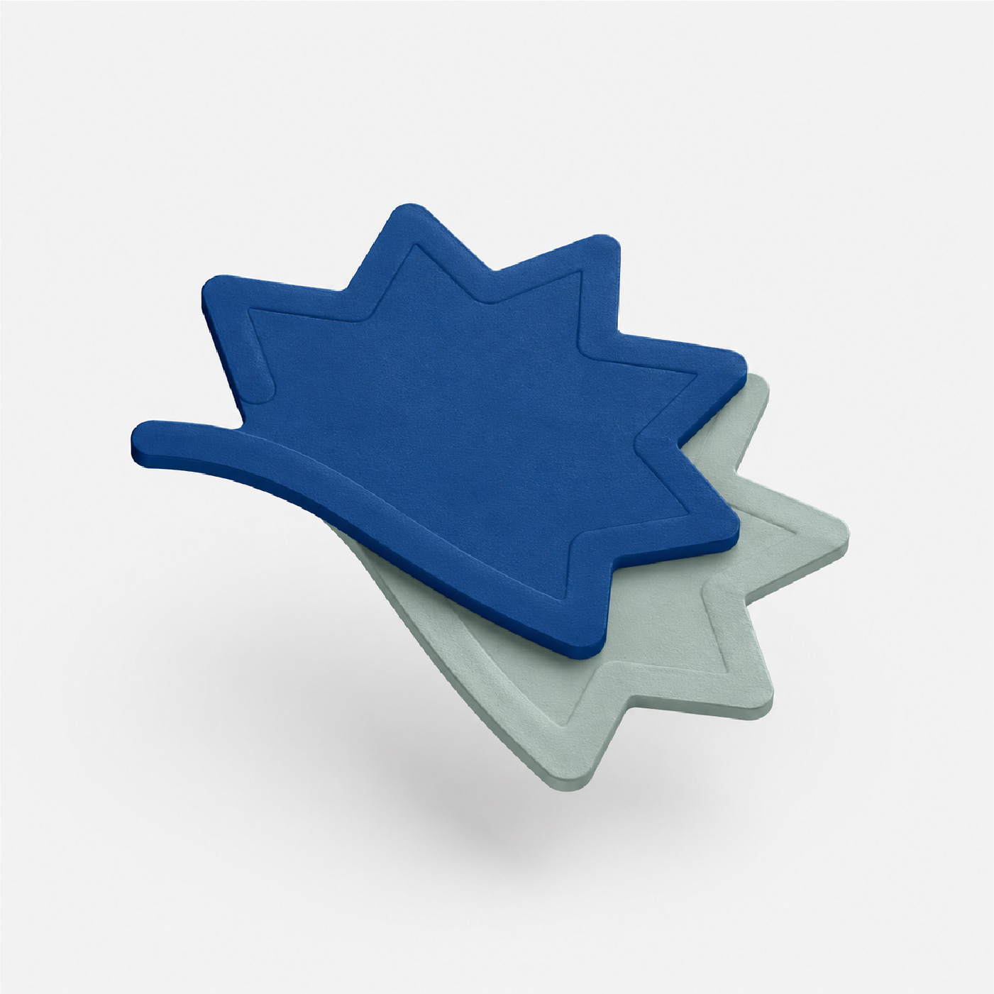
The mark wasn't invented. It's the sun over the slope down to the river, right there on site.
The brief
Aquabar was the project we developed across a full course in Marketing and Personal Branding.
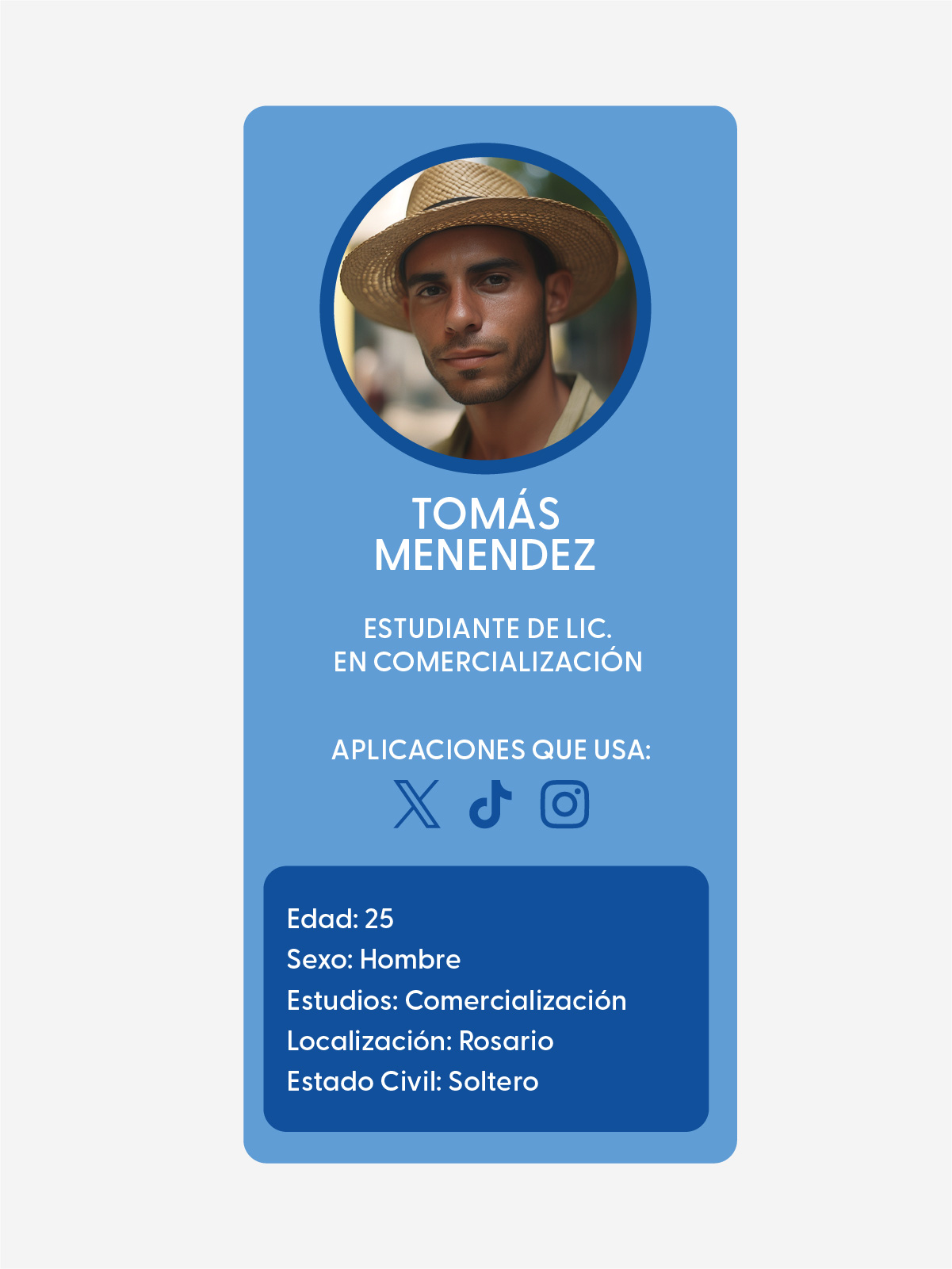
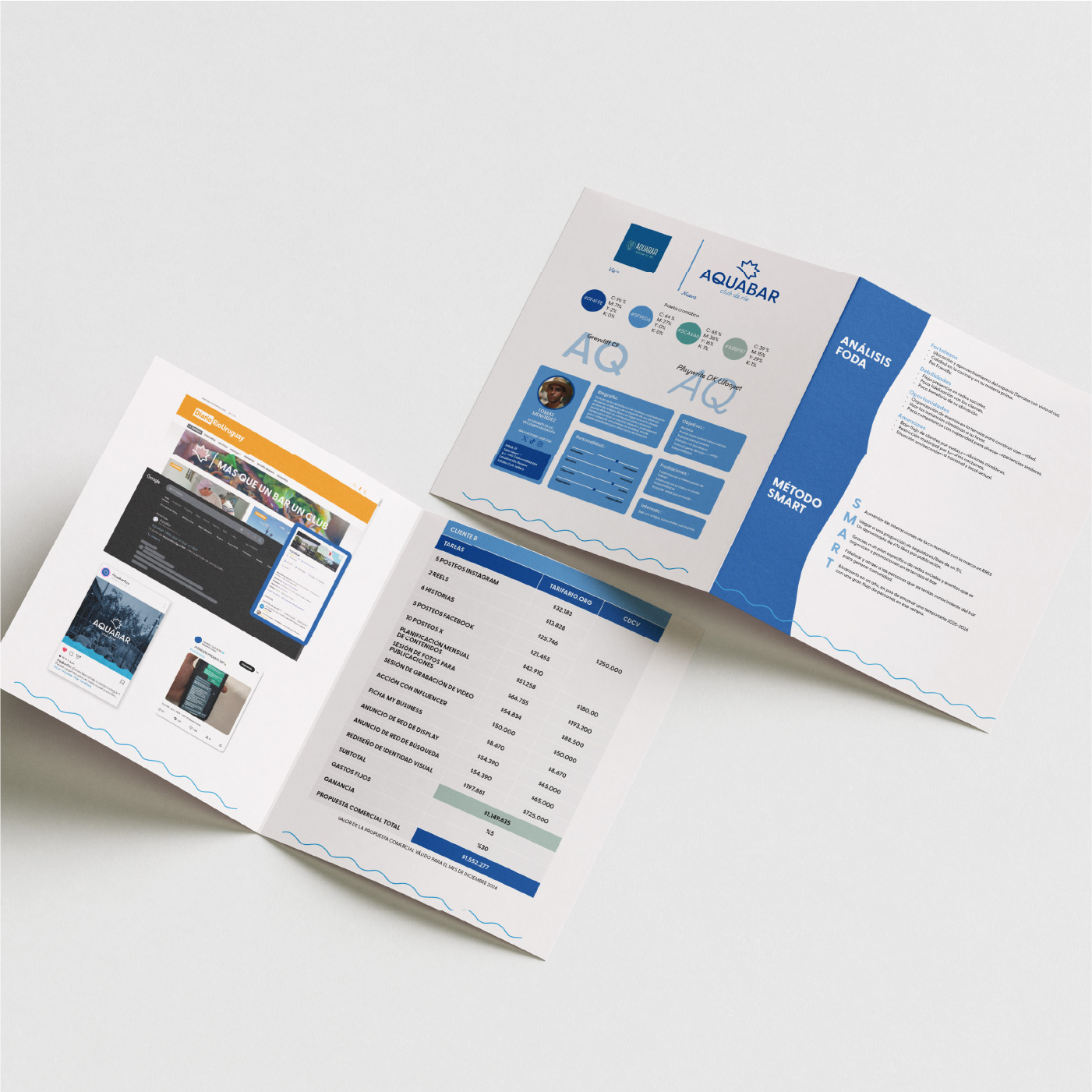
The brief was to pick a real business, local or international, and build a new brand for it alongside a complete strategic framework: SWOT analysis, buyer persona, SMART goals, content planner, influencer selection, neuromarketing and budget.
Everything was presented as a zine for the final review. I worked on it with Santiago and Uriel.
It had the best location in the city and was communicating like any other bar.
The idea
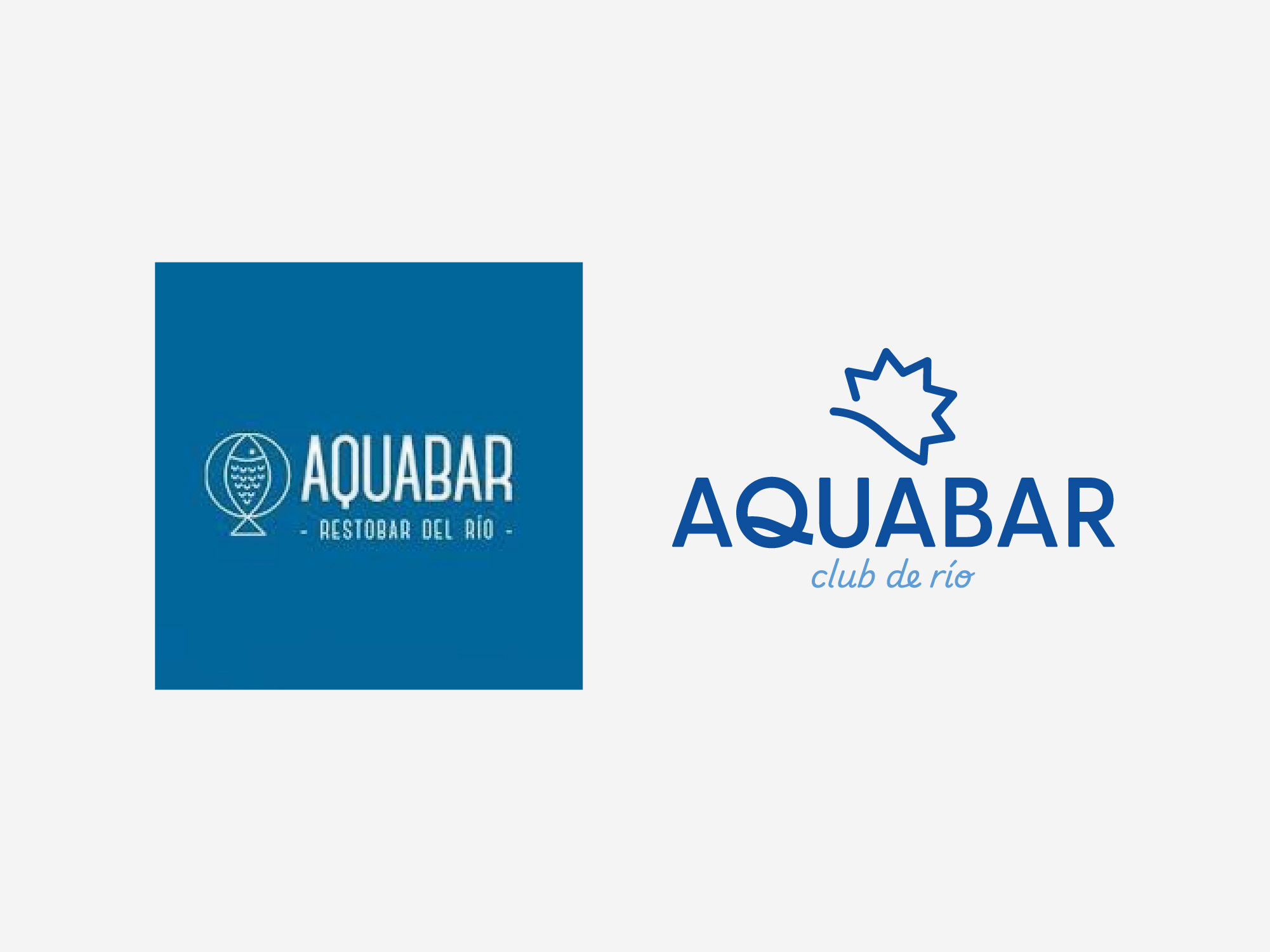
We chose Aquabar, the bar at Rosario's aquarium, because we saw a lot of unused potential. It has a privileged spot by the river, which summer makes even better, but it was being communicated like any other bar. We decided to install a clear differentiator: Aquabar River Club, a gathering place where you don't just eat but also share events and live music.
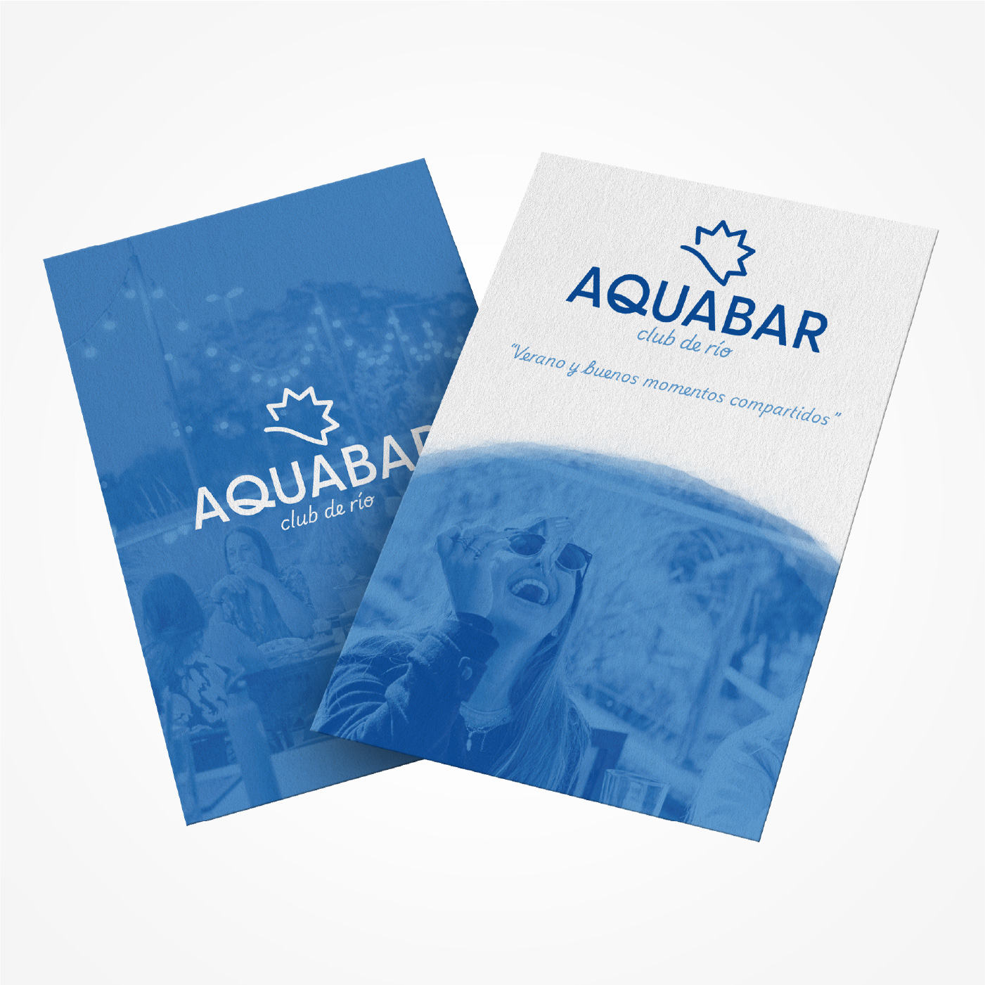
For the mark we replaced the fish — the obvious move, given the aquarium next door — with the sun setting behind the slope down to the river, exactly as it appeared in one of the site photos at dusk. We chose a highly legible sans serif with a distinctive treatment on the Q that echoes that same slope. As a secondary typeface we added an italic, reaching for warmth and a sense of community.
It wasn't just about resolving the design but about thinking through the whole strategy behind the brand.
Development
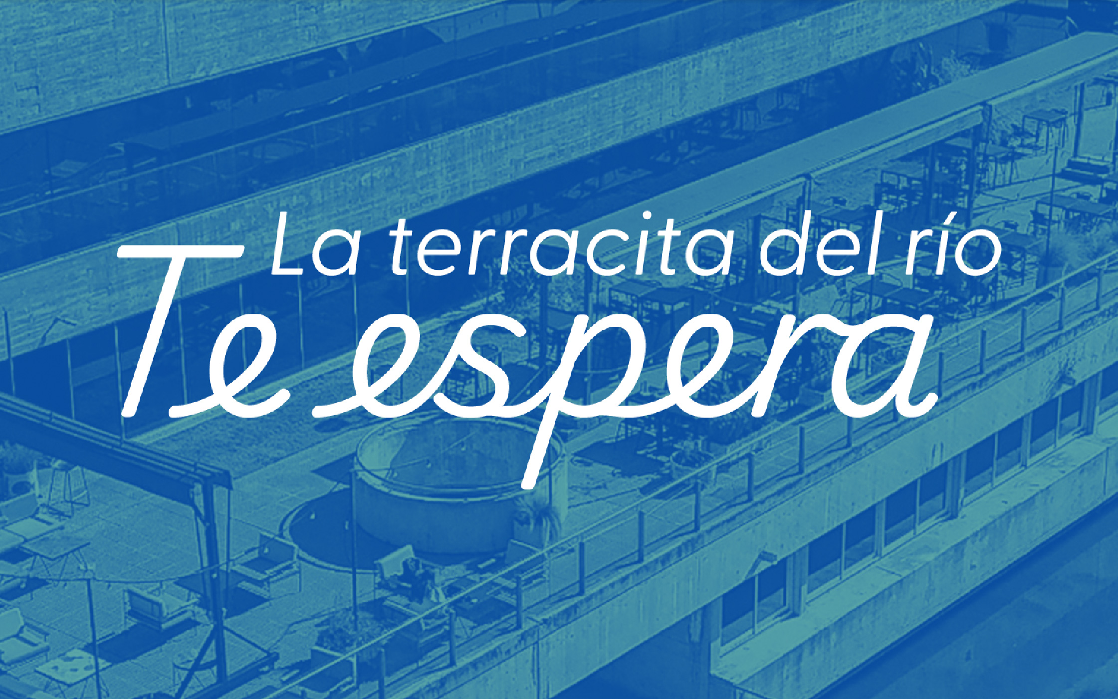
The River Club idea held as an endorsement line, always presented as "Aquabar River Club". That idea carried into communications too: on the Facebook banner, for instance, we used a photo of the terrace with the line "the little river terrace is waiting for you".
This project leaned heavily on the marketing side, something we hadn't worked through in that depth before. It forced us into an integrated, cross-disciplinary way of looking at the problem.
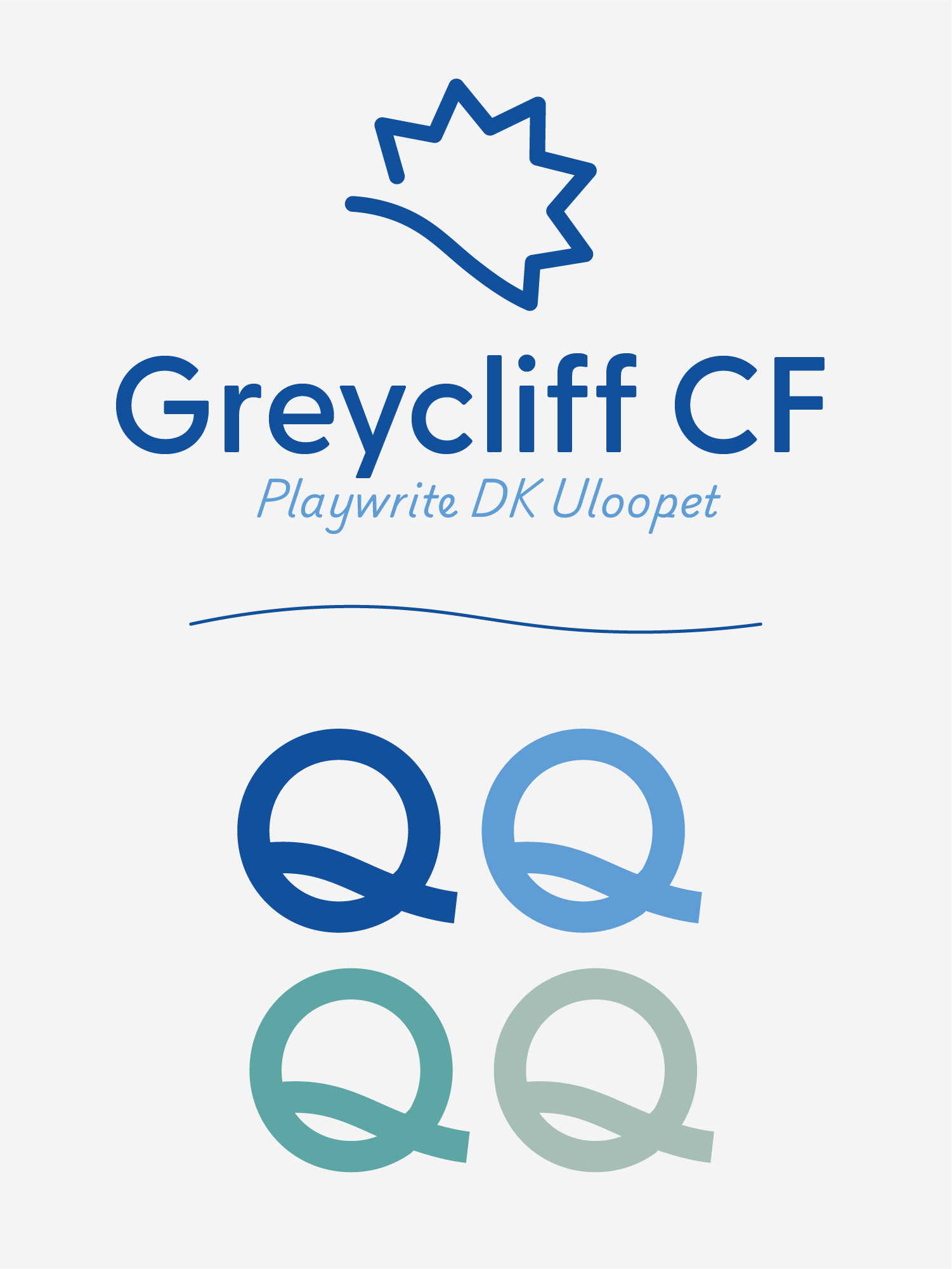
The Q repeats the river slope. It's the only intervened character in the whole family.
Applications
The strategy either showed in the pieces or it didn't. The zine argued it; the coaster put it on the table.
Outcome
A good visual identity needs a strategy just as solid behind it.
What I take from this project is having approached the brand from a more integrated point of view. The final result reflected that joint work: the brand wasn't defended for looking good, it was defended for being consistent with a strategy on paper.