Blueprint.
University project — final examination, Editorial Design Studio (UAI)
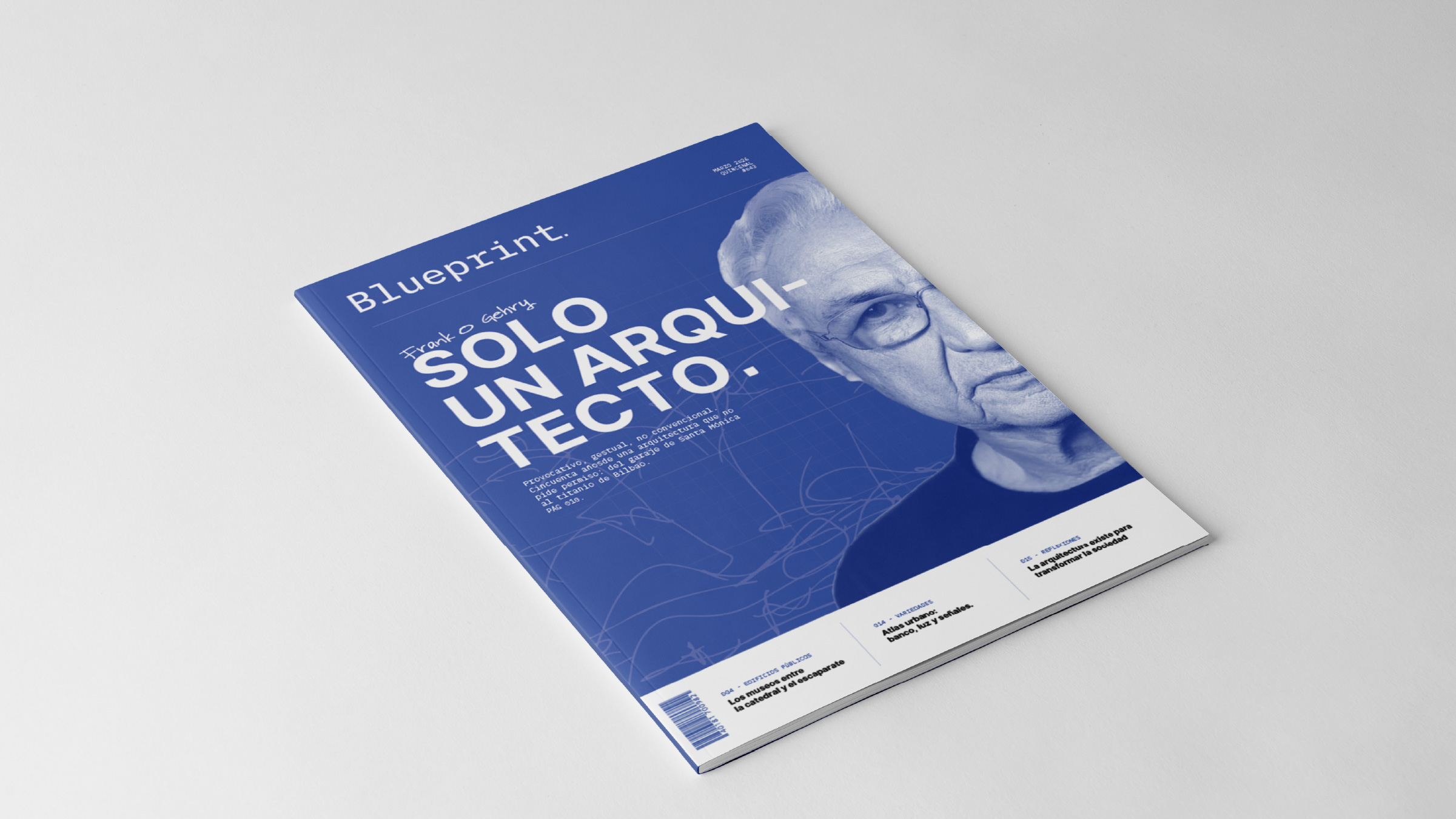
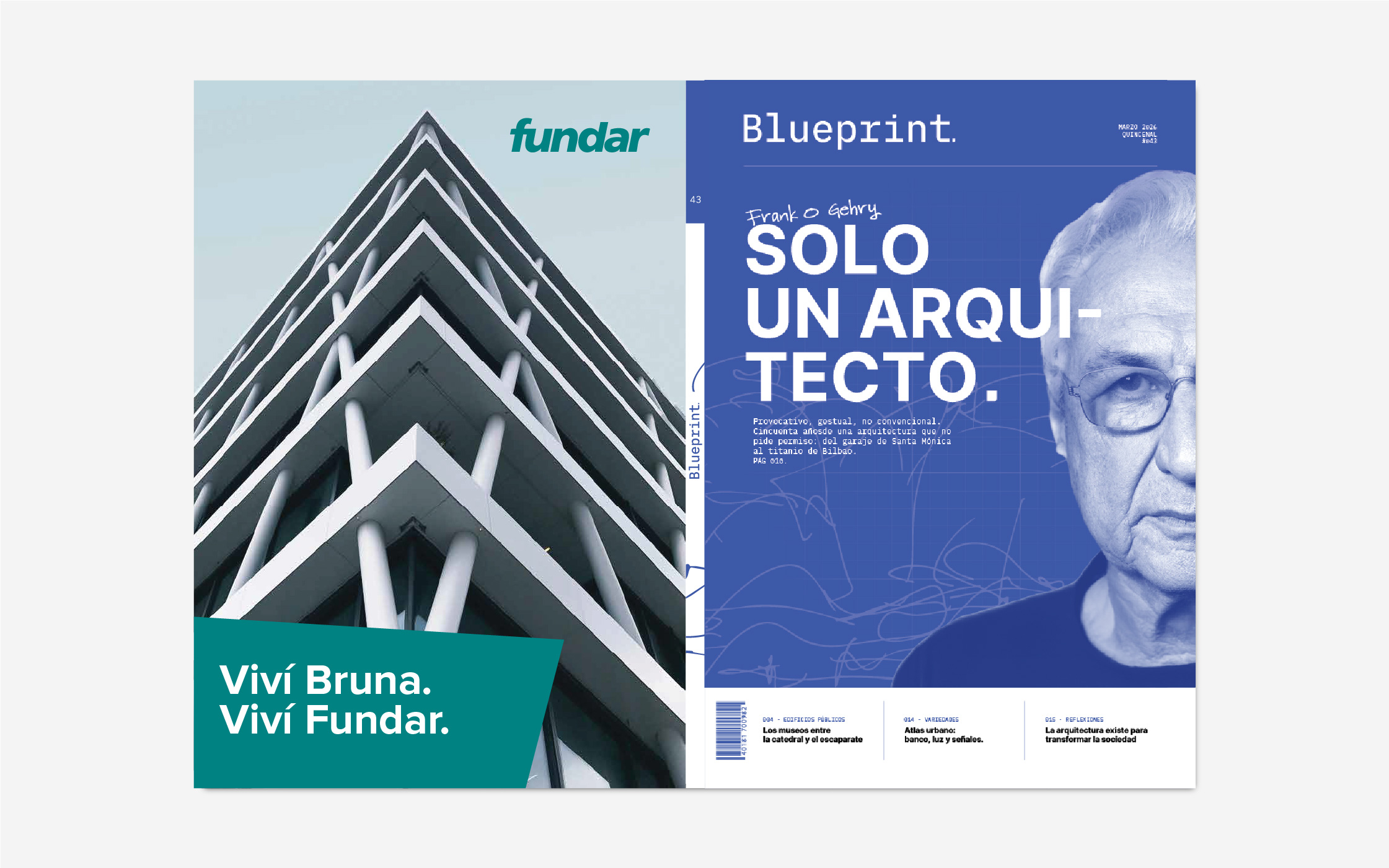
The cover is already a contents page. You start reading the magazine before you open it.
The brief
Blueprint. was the final examination for the Editorial Design studio: design a specialist magazine of 80 pages, developing 19 of them plus the cover spread.
The type of publication was assigned by the faculty, and I got architecture. It was a solo project.
The faculty supplied only the article headlines — writing the content was down to me, and the rest of the layout had to be completed with blank pages, as the brief specified.
The faculty gave me the headlines. I wrote the articles.
The idea
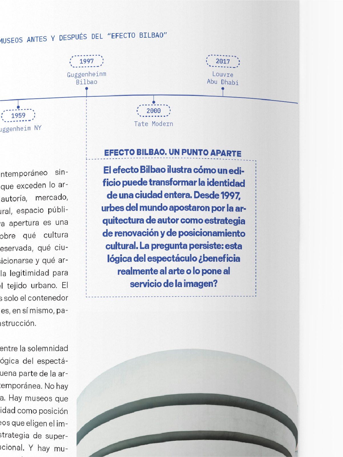
Blueprint. was conceived as a monthly magazine aimed at a narrow audience inside the world of architecture — closer to a collector's object than to a mass-market publication. The whole identity comes from one idea: blueprints, technical drawings. That's where the graphic devices, the palette and the typographic decisions all came from.
The whole identity comes from one idea: technical drawings.
Development
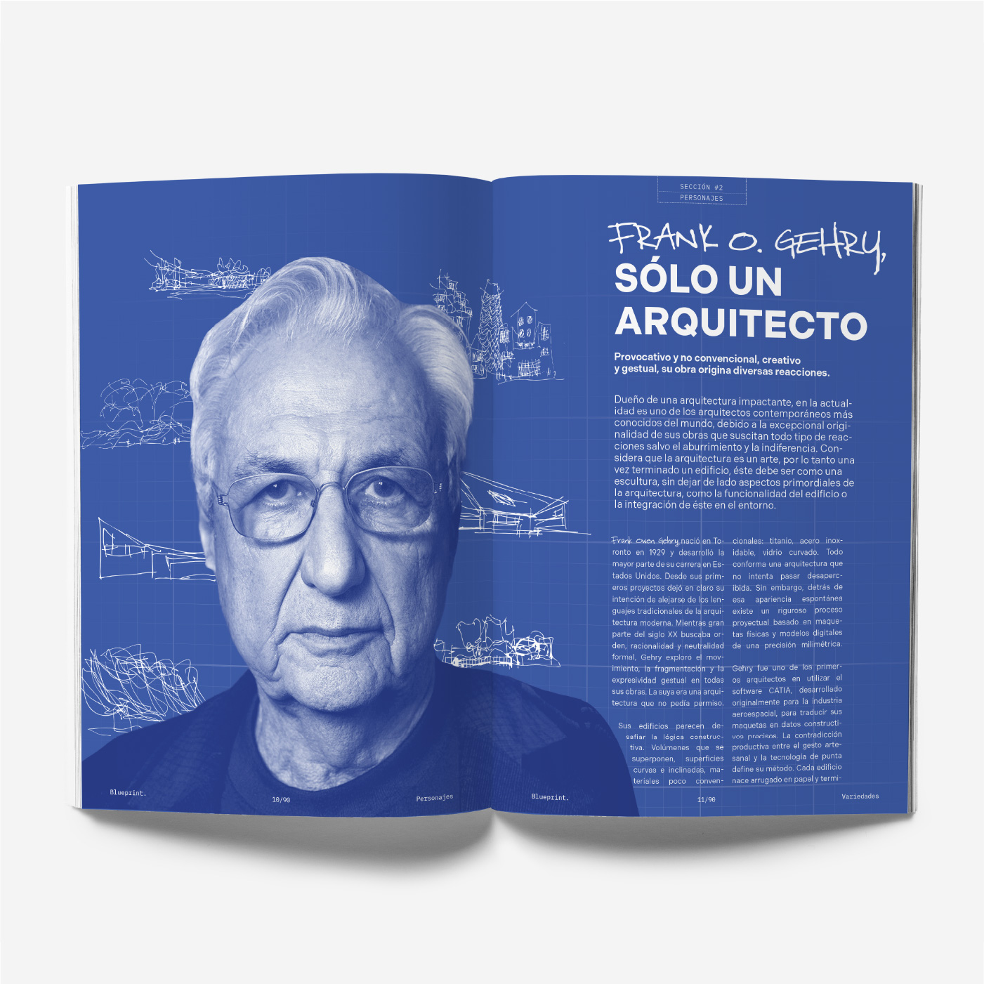
The magazine is organised around three main articles. The first covers the transformation of museums, from the silent, monumental temple to the "Bilbao effect" Gehry's Guggenheim set off. The second is a profile of Frank O. Gehry. The third reflects on the social and political role of architecture, taking vernacular architecture as its reference.
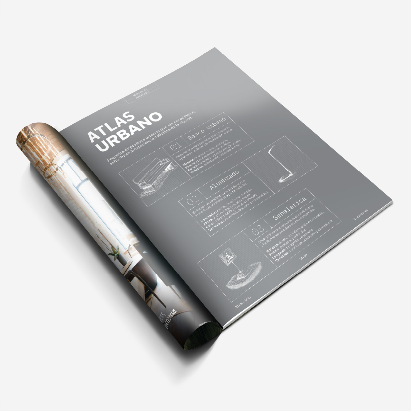
Across the pages I interleaved photography with illustration and technical annotation wherever the article called for it, keeping that drawing logic always present.
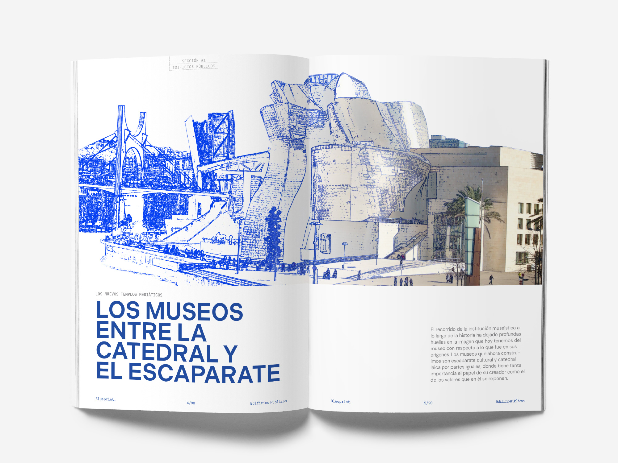
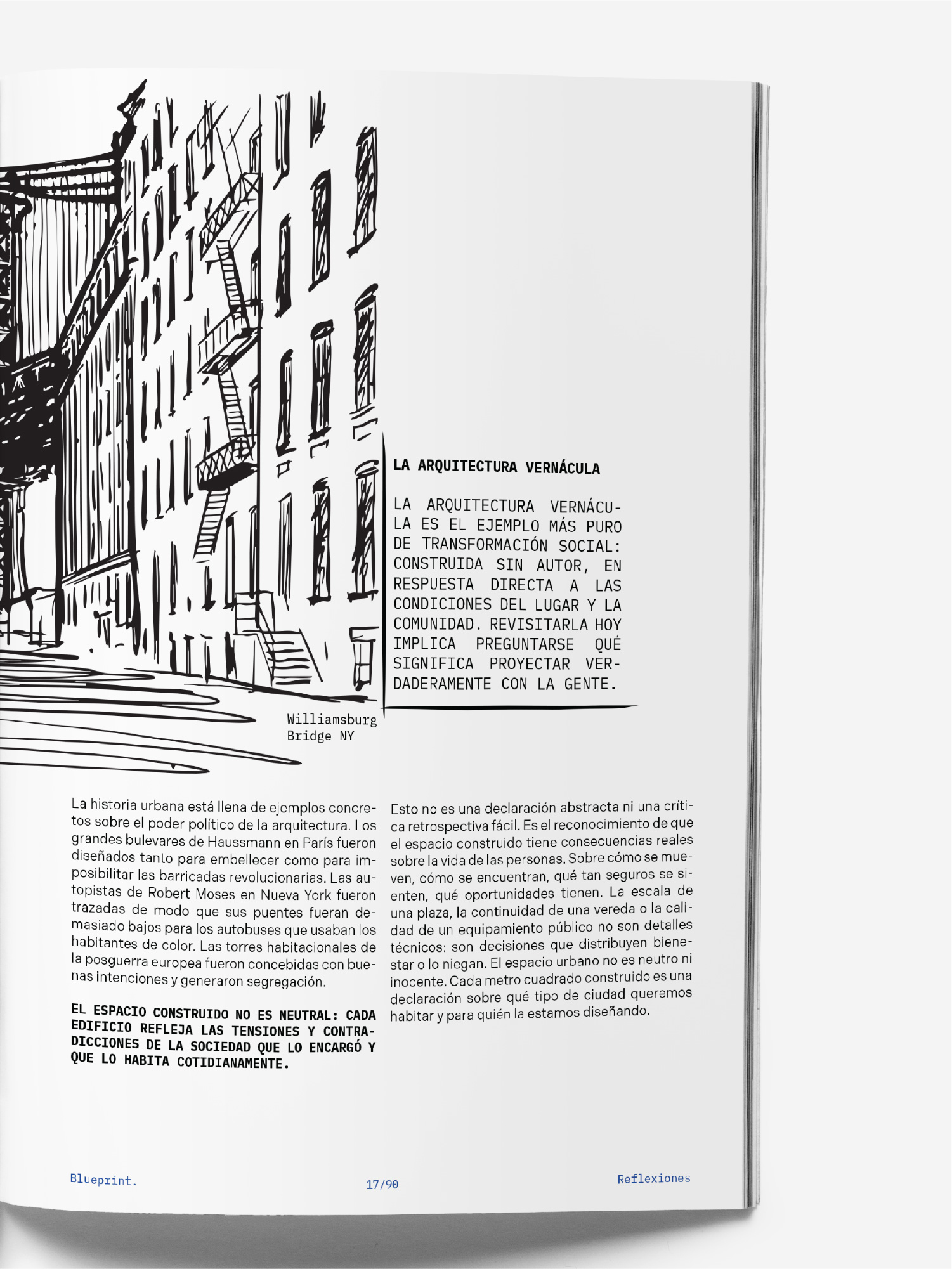
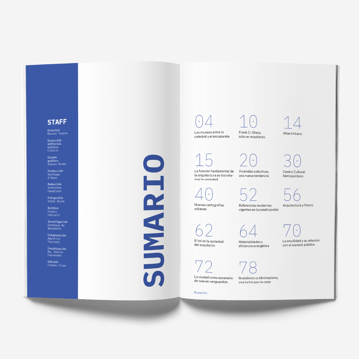
Mono for the technical annotation, sans for the body. Two voices on the same page, one baseline grid.
Applications
A magazine is finished at the cover spread: that's where you find out whether the object holds up closed.
Outcome
Designing also means knowing how to accommodate a point of view that isn't only your own.
The project passed. Along the way I had to find a middle ground between my push toward something more minimal, true to Blueprint.'s identity, and the faculty's view, which asked for more semantic weight in the articles. That back and forth ended up being part of what I learned.