Backstage!
University project — Editorial Design Studio (UAI)
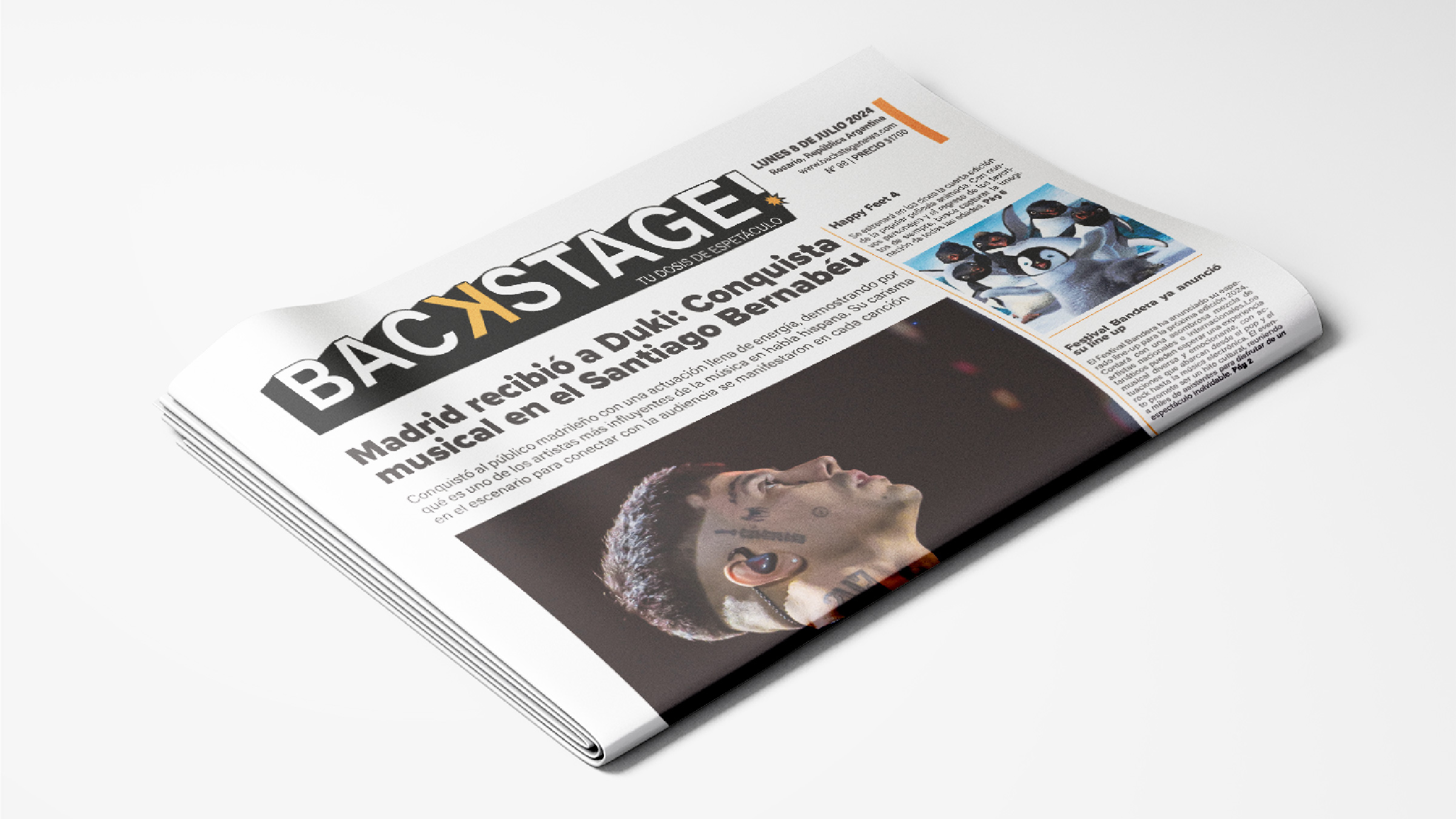
An English word that audience was already using without translating it.
The brief
Backstage! was the second project for the Editorial Design studio: design an entertainment newspaper aimed at young adults.
We had to develop the paper's masthead, its print editorial design following specific requirements, and a digital version. I worked on it with a classmate.
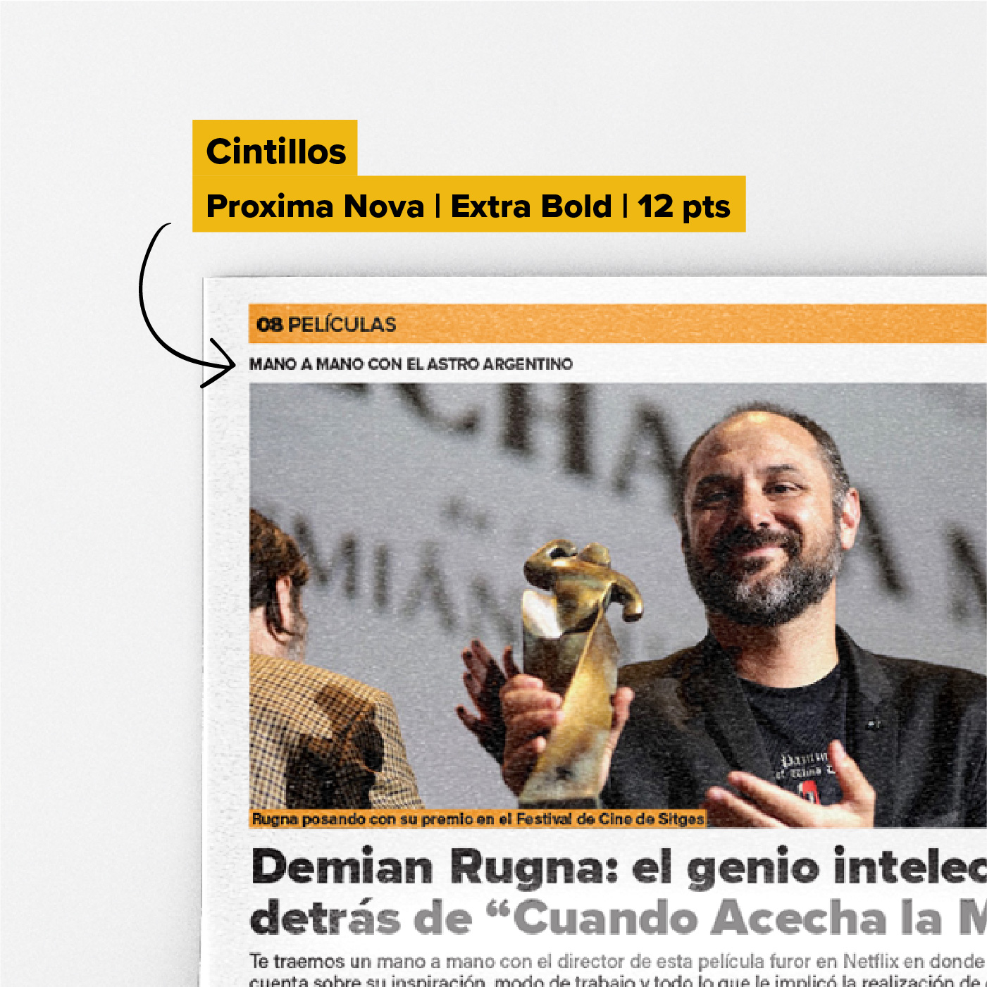
The brief specified the target audience, the number and type of sections the paper had to carry, and the detail of every article: whether it took a kicker or not, whether it had a headline and standfirst or only a headline, among other variables.
The brief went down to the detail: which article took a kicker, which took a standfirst, which took only a headline.
The idea
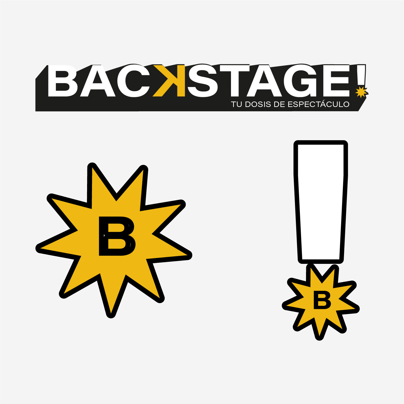
We were after an aesthetic with a young presence, and that decision drove the choice of colours, typography and article topics. The target audience also gave us room to play with the name: we chose an English word, "Backstage", a piece of slang that audience is familiar with.
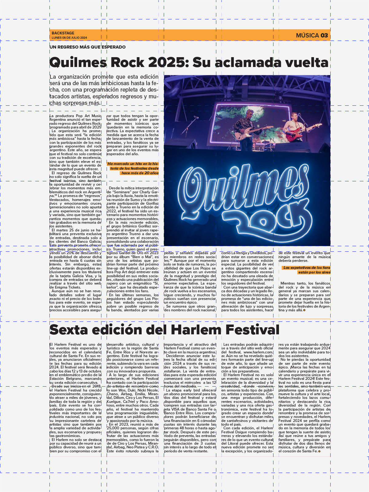
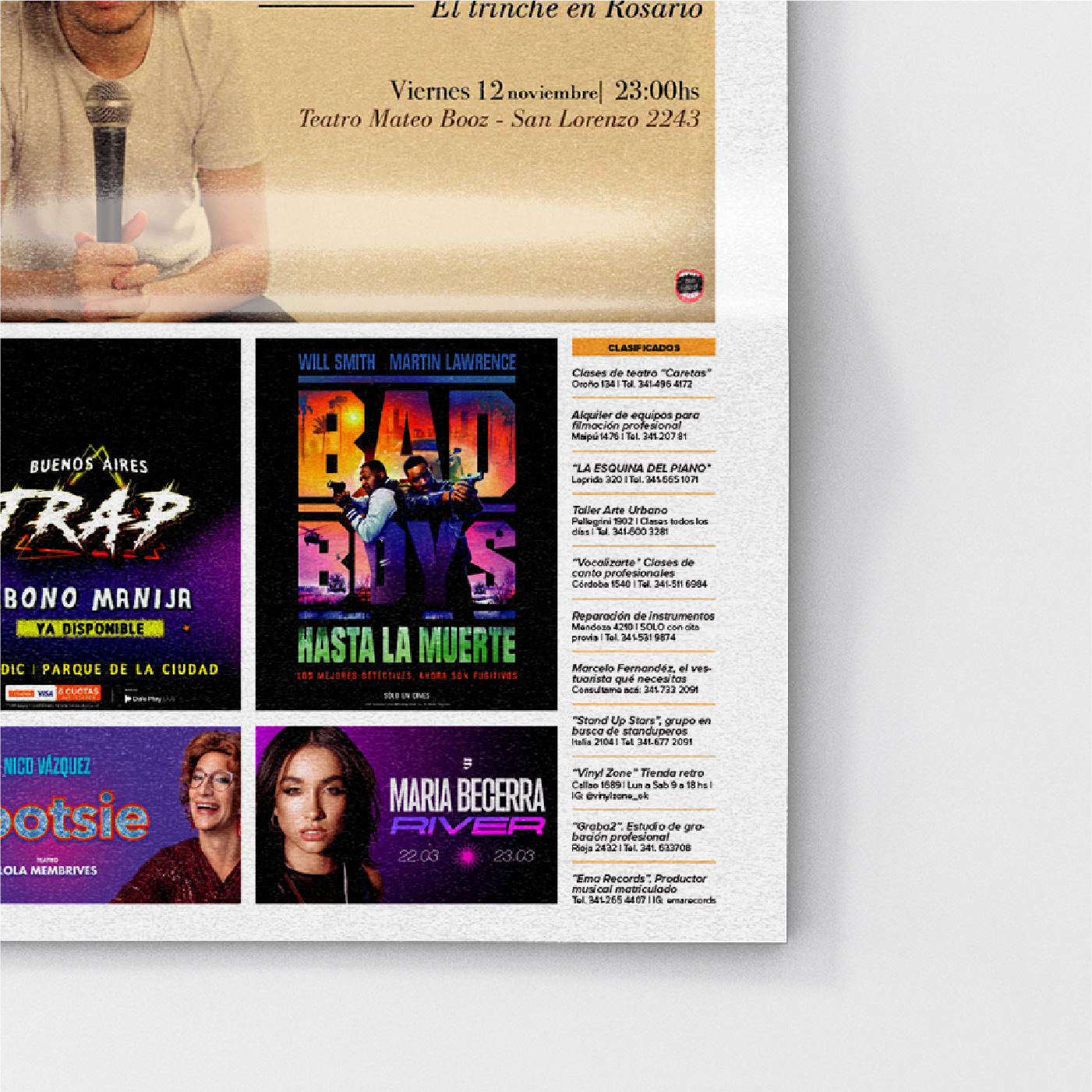
We had to land a working grid without the content jamming up between columns and sections.
Development
Working in newspaper format meant handling far tighter spaces than a magazine, which demanded fine control of typographic theory: choice, proportion and grid. The grid was one of the biggest challenges. That effort of judgement and independent thinking was what took most of the project's time.
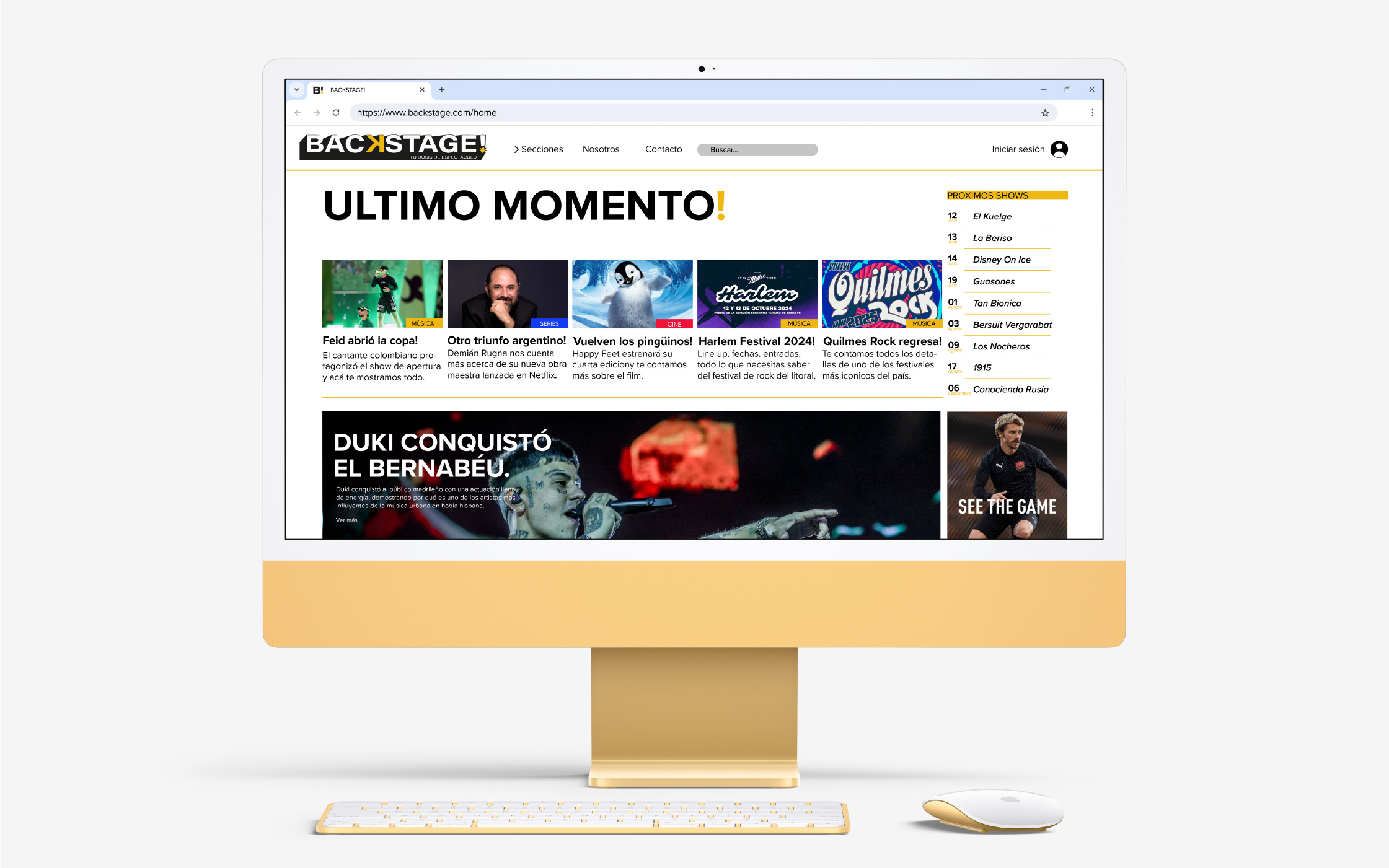
The digital version had to hold those same hierarchies in a width that wasn't the paper's: the newspaper grid translated to screen.
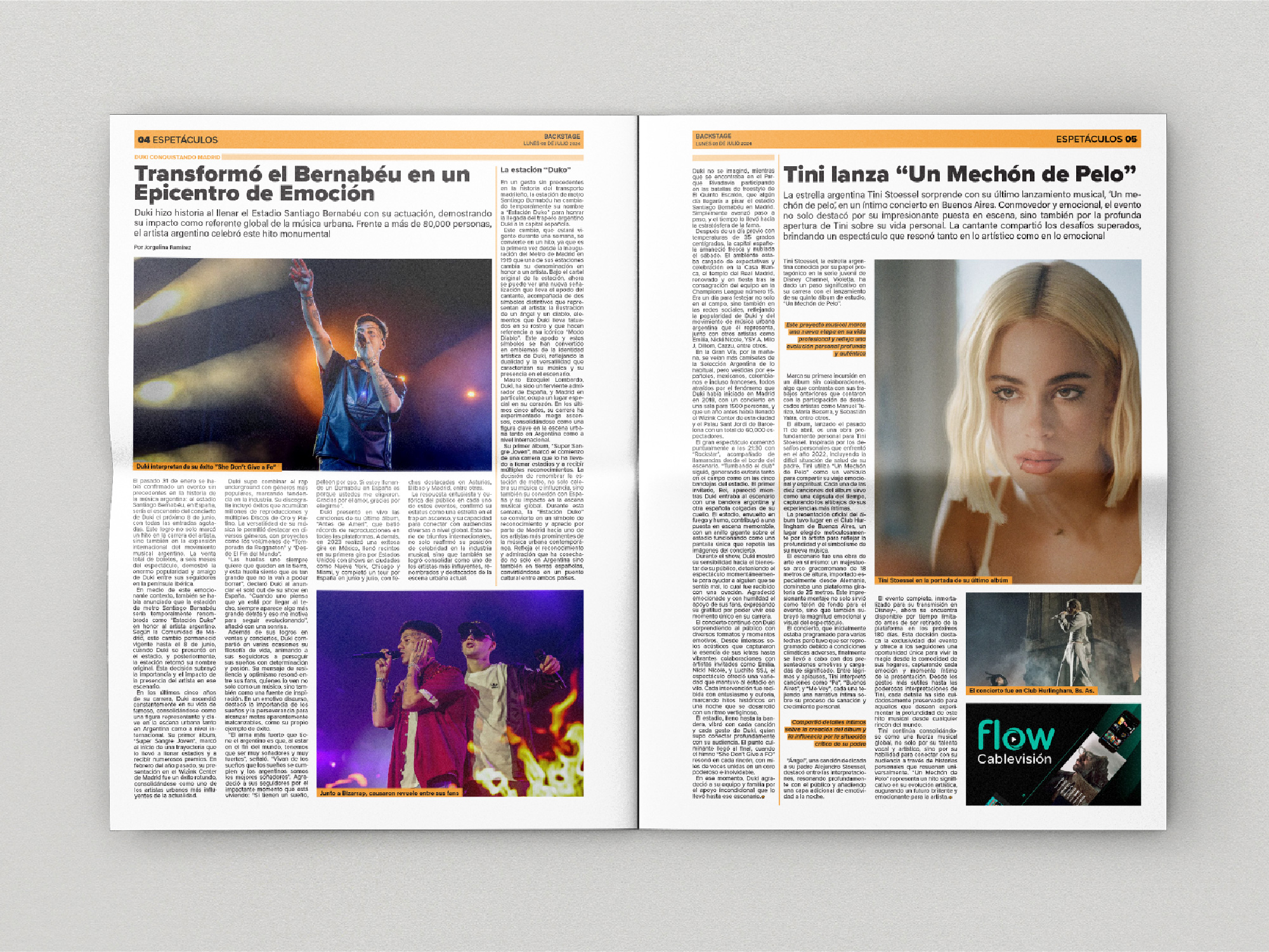
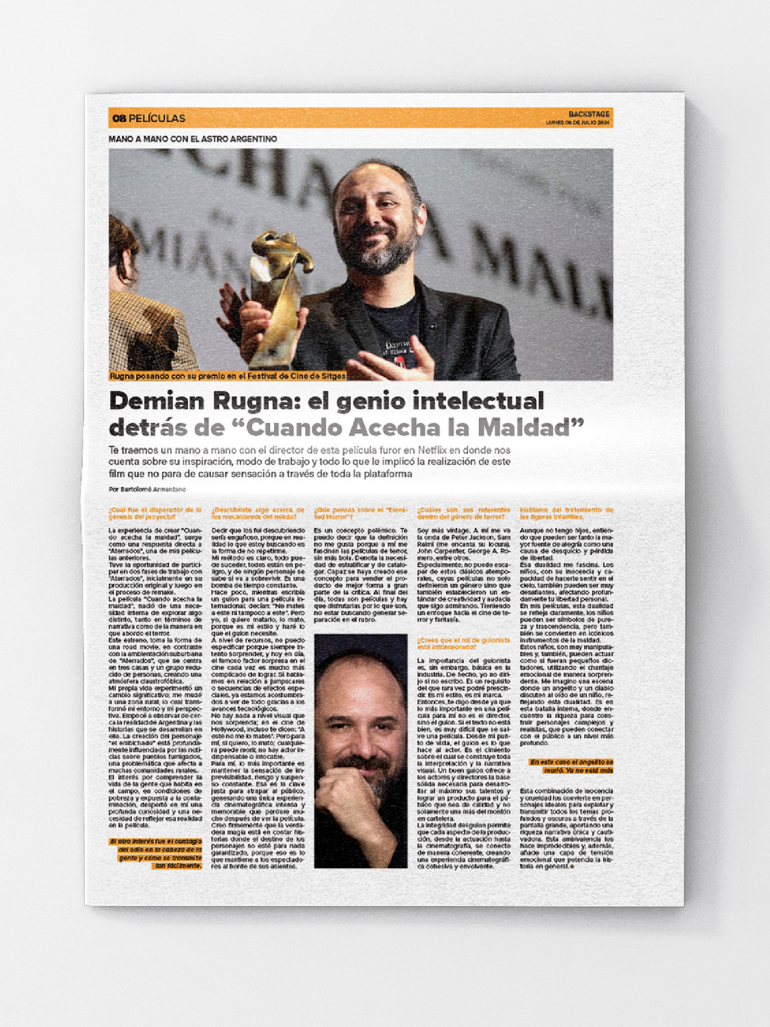
Five columns here, four in music. The baseline grid doesn't move.
Applications
The paper had to exist off the page too, holding the same hierarchies in a width that wasn't its own.
Outcome
An exercise in typographic precision and system.
Finding the balance between a young aesthetic and a grid that worked in a format as demanding as a newspaper is what I take from the whole process. It's the project that most taught me to distrust the eye and trust the measurement.