Rosario City Brand
University project — Visual Communication Studio IV (UAI)
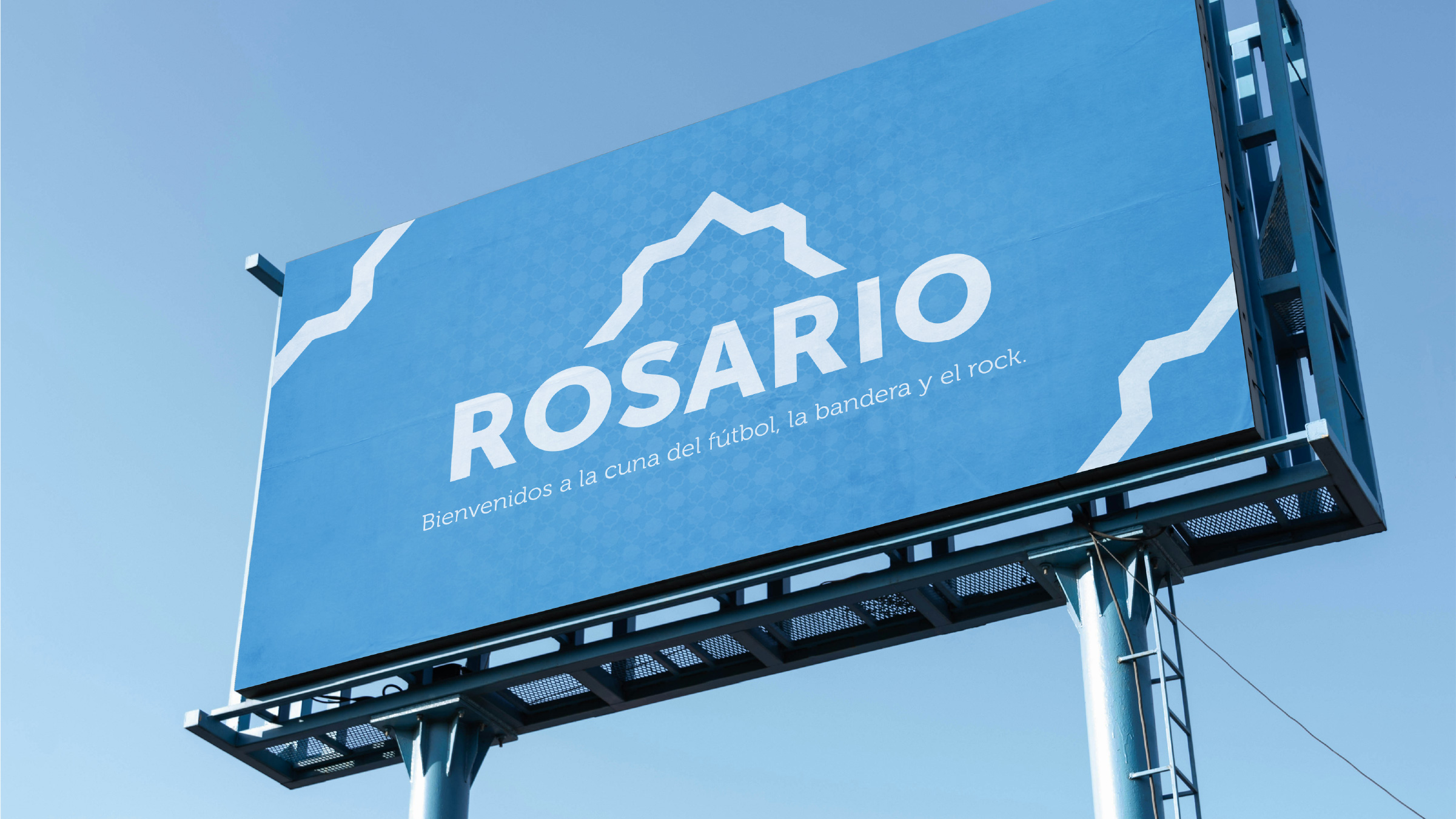
The previous brand never made it to the street. This one arrives by motorway.
The brief
Rosario City Brand started as a term project for Visual Communication Studio IV, with three classmates: Santiago, Agustina and Cire.
The brief began with a brand redesign and grew in scope week by week, until it covered every system a city identity needs: wayfinding, pictograms and urban signage.
Rosario had gone through several city brands over the years. The one in use before this project carried a central problem: no recall. Money had gone into designing it, never into applying it — it had almost no real presence in the city.
The problem was never the previous brand's design. It was that it never reached the street.
The idea
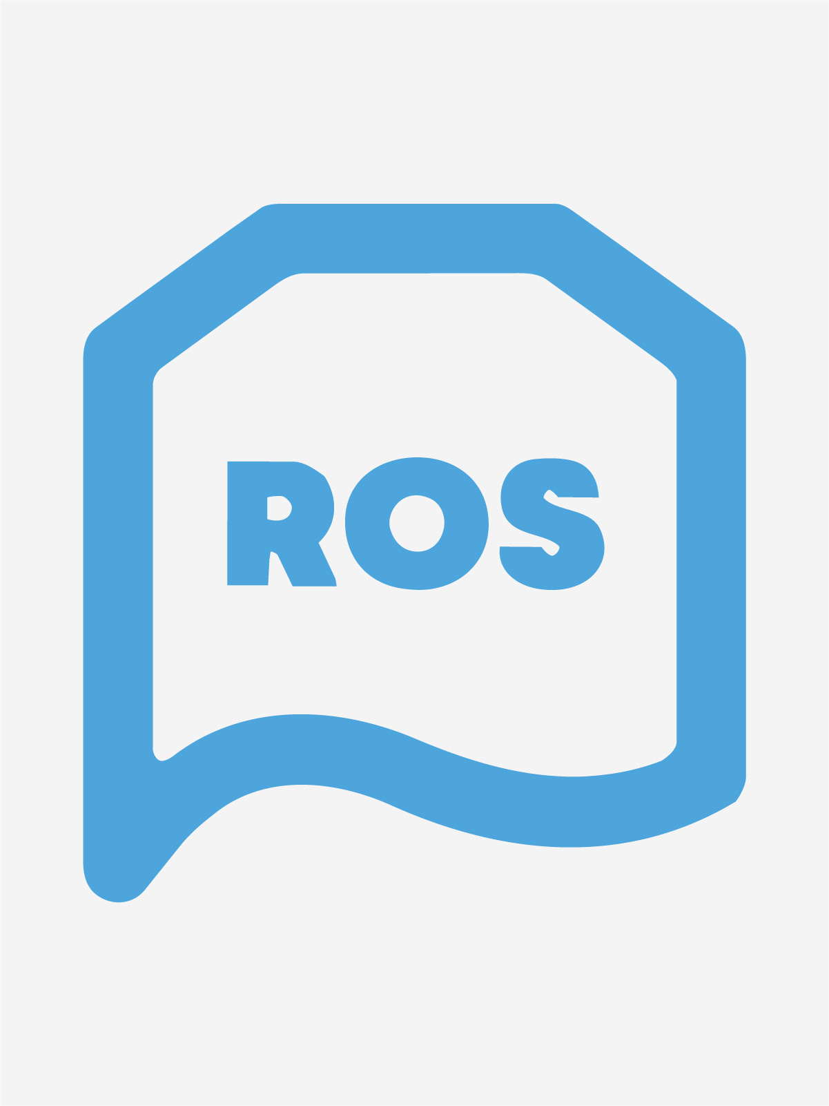
The direction came together quickly: identify the problems, put the steps in order, and go back to what the people of Rosario already recognised as their own. That last point was the key — once we understood the job was to recover an existing bond rather than impose something new, the logotype fell into place. The process was direct, with no detours.
The job was to recover an existing bond, not to impose something new.
Development
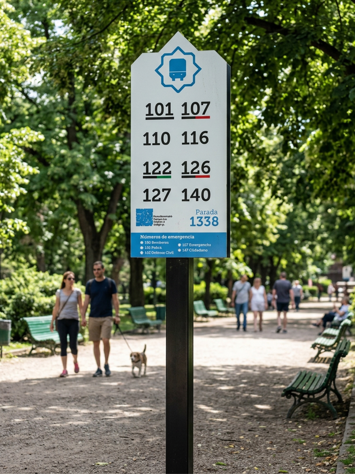
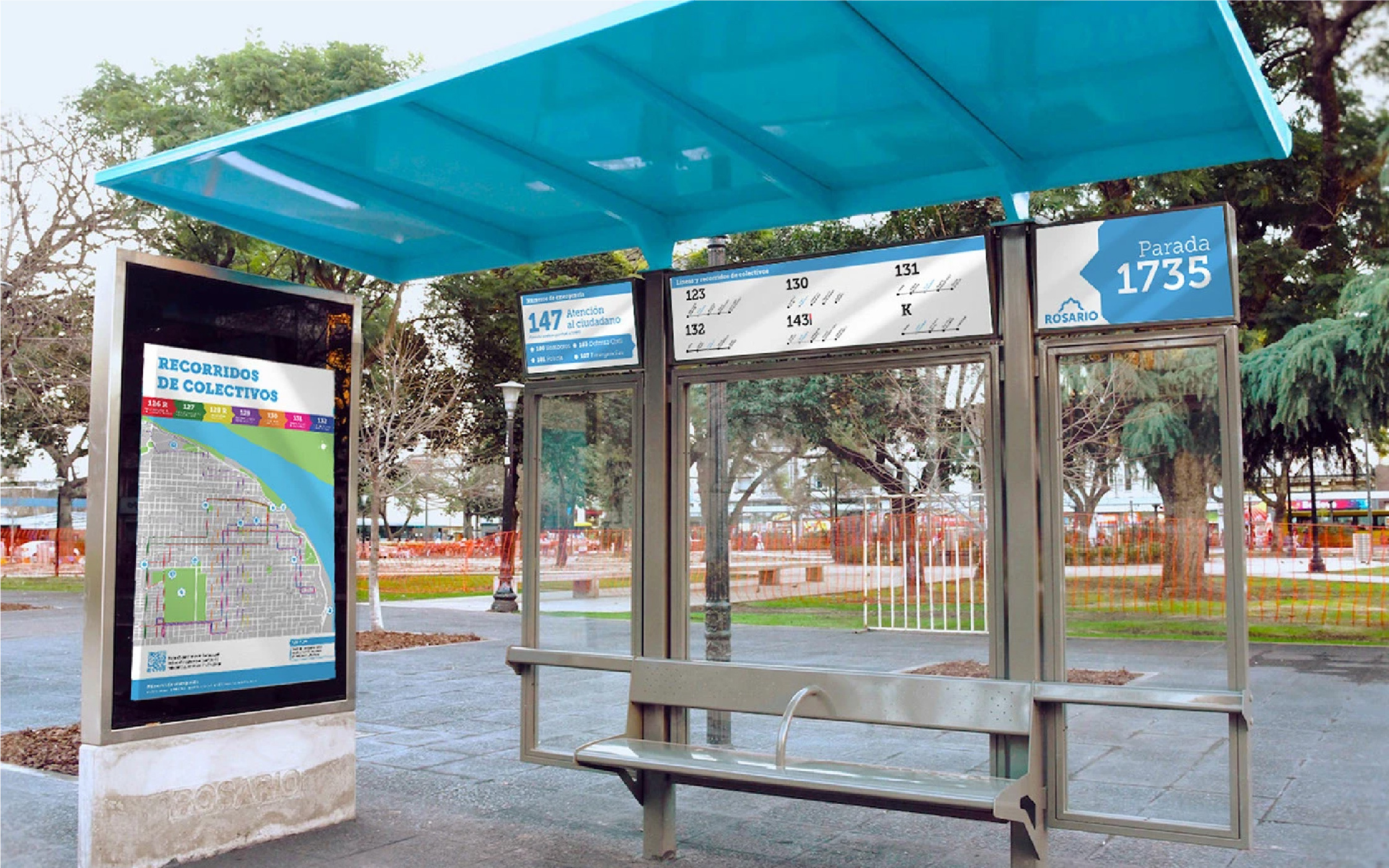
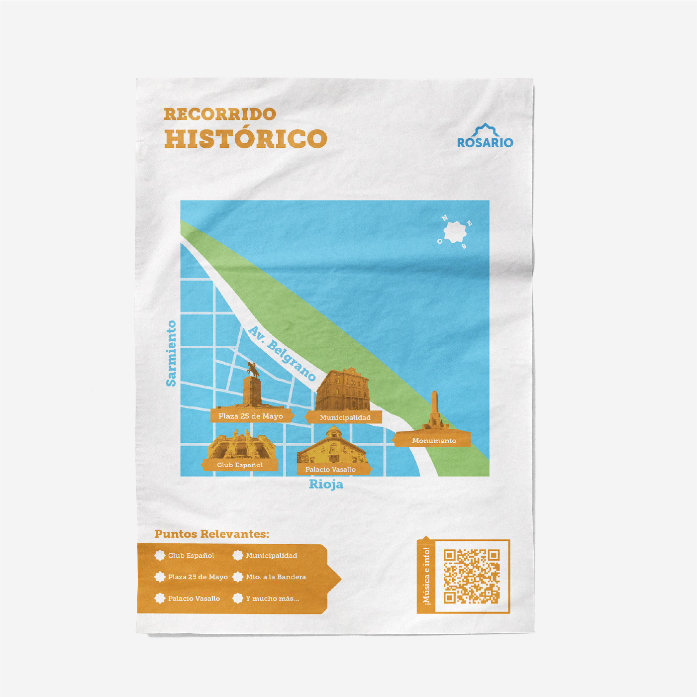
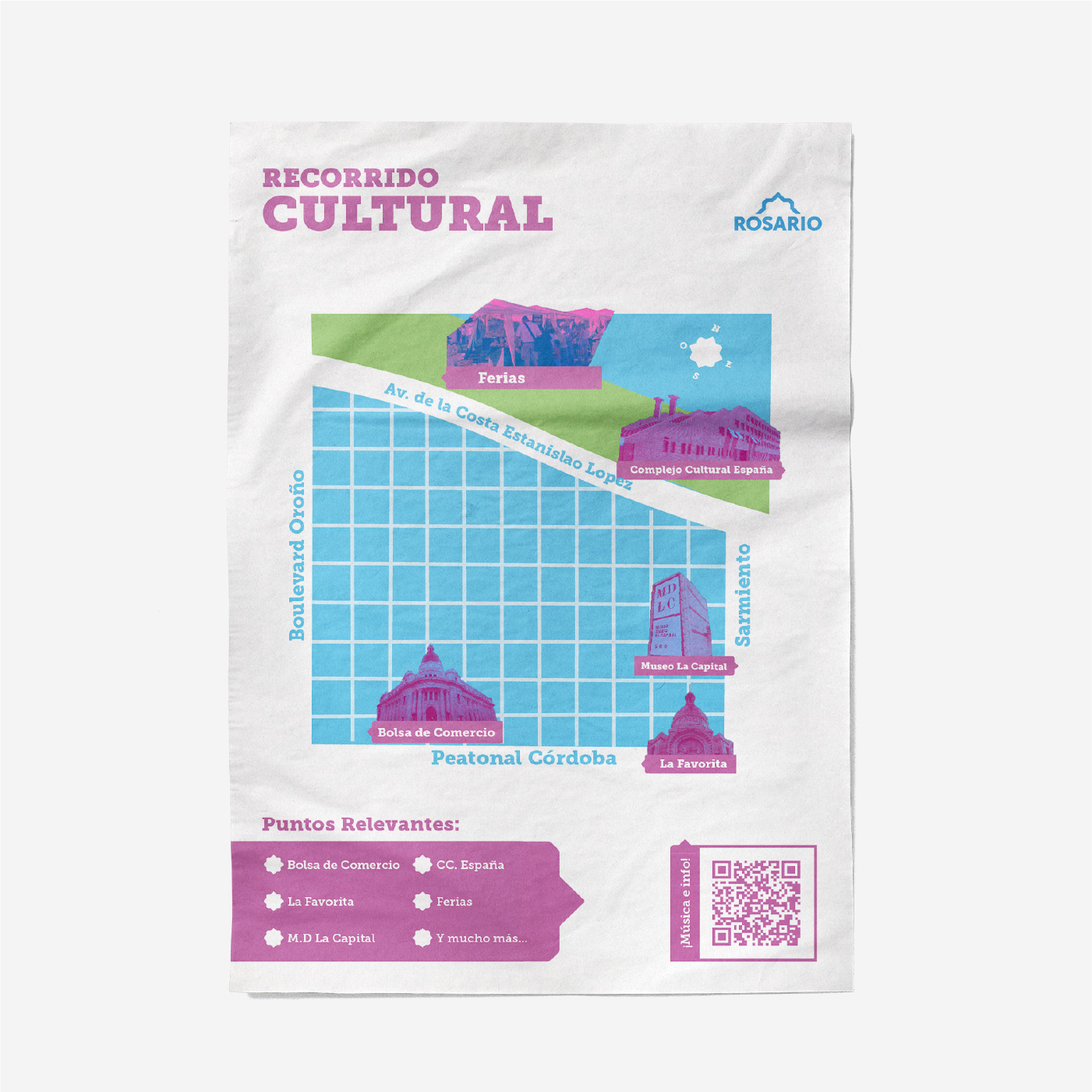
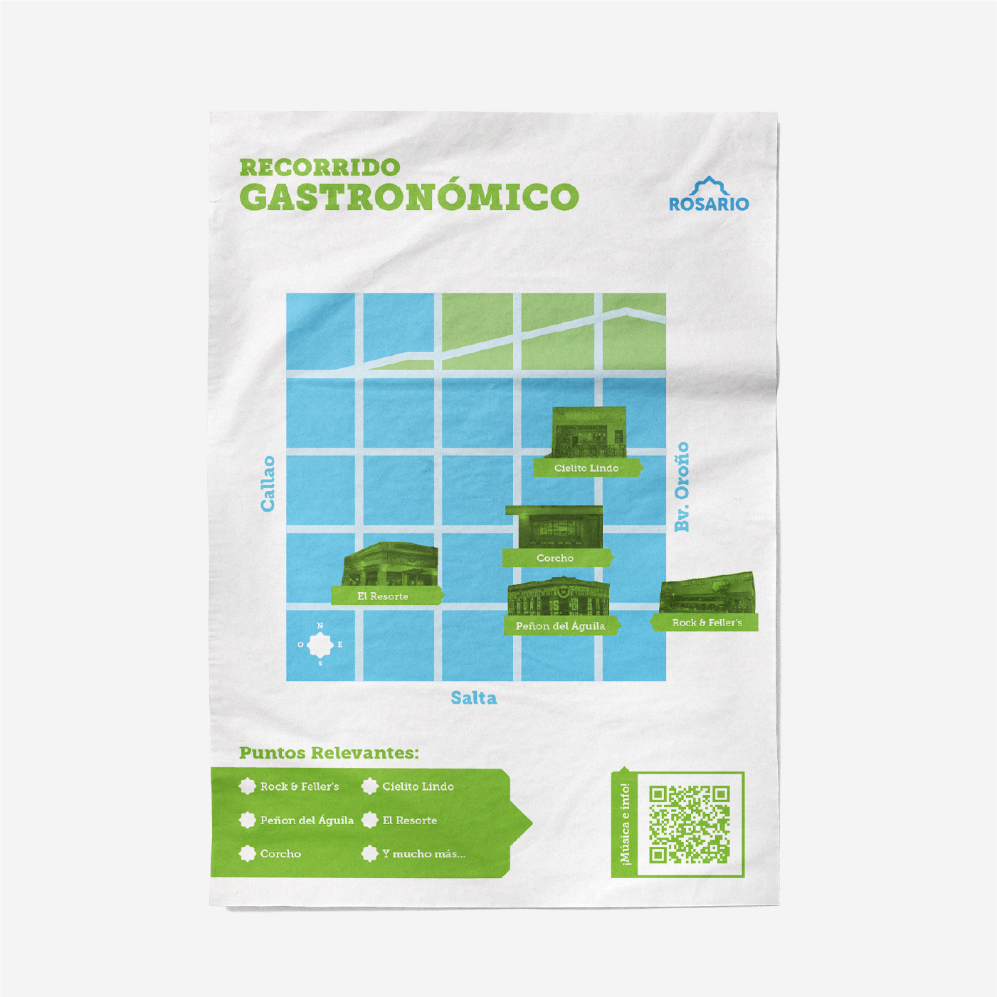
We worked in two fixed pairs throughout. In the first stage, Santiago and I handled the visual identity while Agustina and Cire developed the pictogram system. With that base settled, we moved on to signage: the brief called for a bus shelter carrying a map of Rosario and its main transit routes, plus three tourist trail signs — historic, cultural and food.
For the final stage we split wayfinding into four levels of complexity: levels 1 and 2 went to Santiago and me, levels 3 and 4 to Agustina and Cire. The whole process was presented to the faculty panel across three reviews.
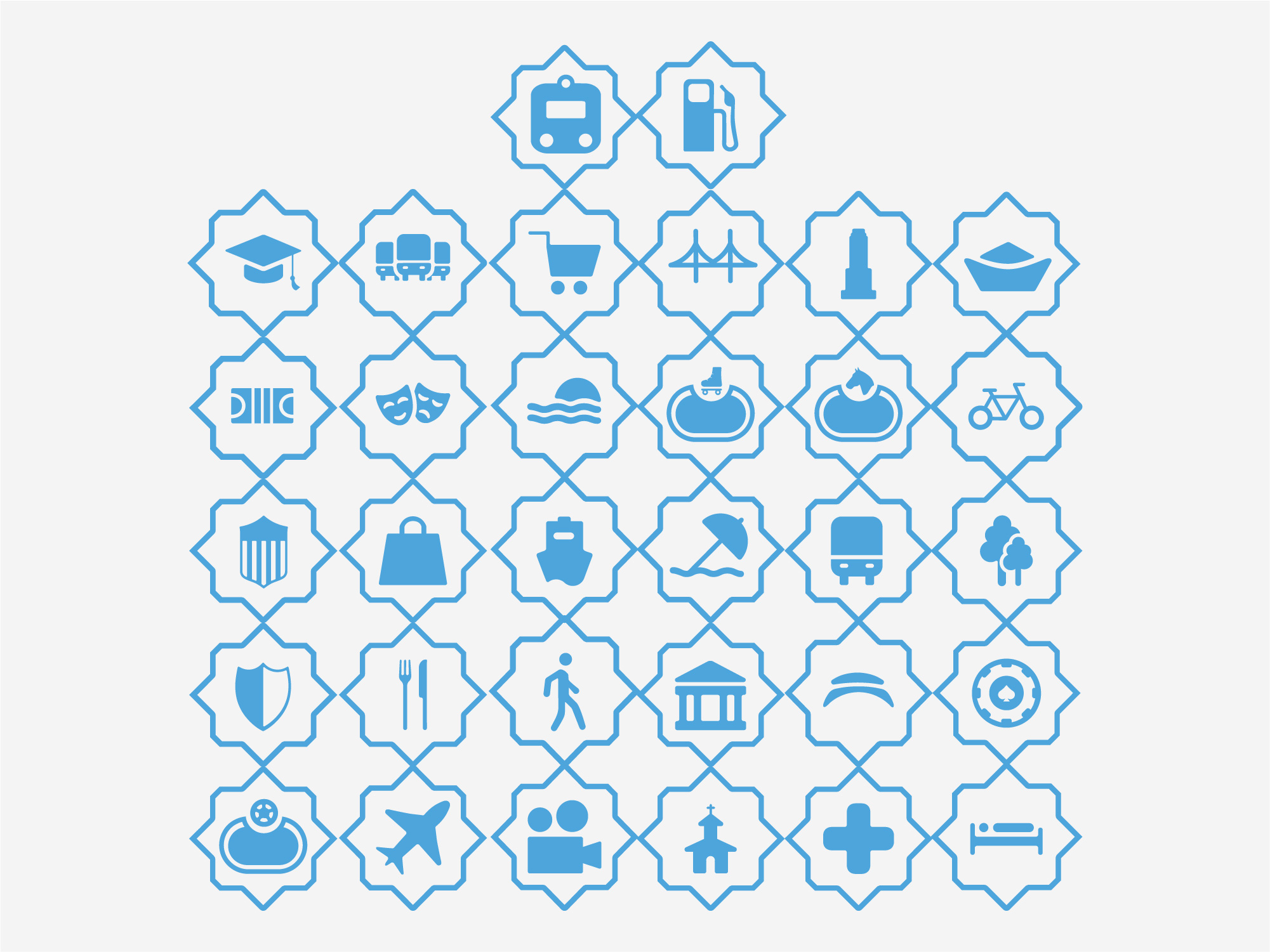
The pictogram frame is the logo mark itself. The brand isn't applied on top of the system — it contains it.
Applications
The brand moved into real pieces: the bus shelter, the trail signs and urban wayfinding across all four levels.
Outcome
The project closed with a complete, applicable system — not a logo on its own.
What I enjoyed most was extending what we'd set up in the identity across the whole system: thinking through the full graphic universe, from merchandise to social media to urban signage. Working on a city identity forced me to think at urban scale — every decision had to hold up on a sign ten metres away and on a two-centimetre pictogram.