Raid Tablets
University project — Redesign of existing packaging (UAI)
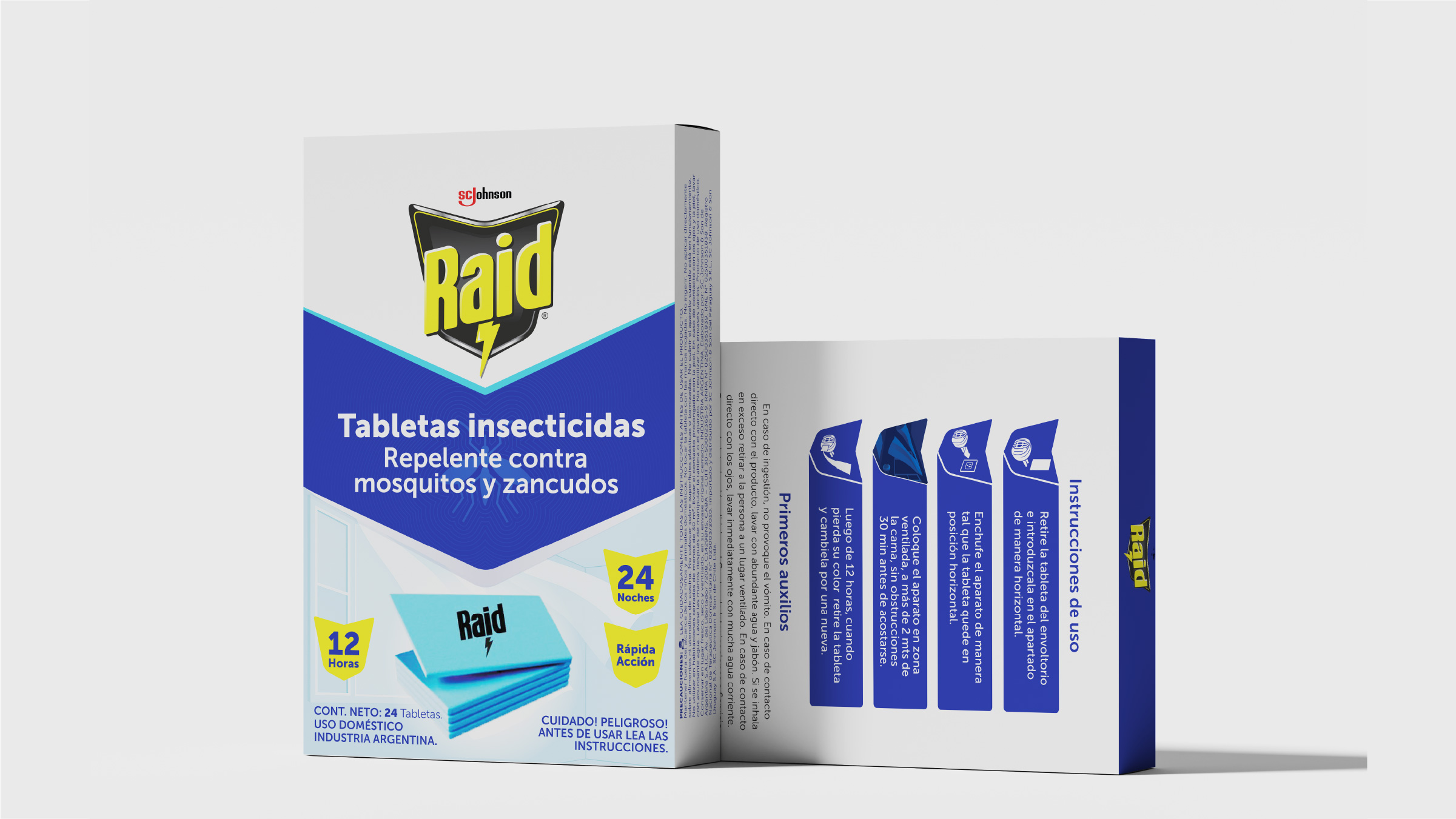
The whole line had been updated. The tablets were still running the old design.
The brief
For the Packaging course the brief was to select an existing product on the market and improve it on your own terms, either through the structure or the graphics.
I chose Raid's insecticide tablets because I'd noticed they had fallen out of step with the rest of the line: while other products in the range had received a visual update, the tablets were still running an older design, outside the system. It was a solo project.
There was no language to invent. There was one the brand already had, to go back to.
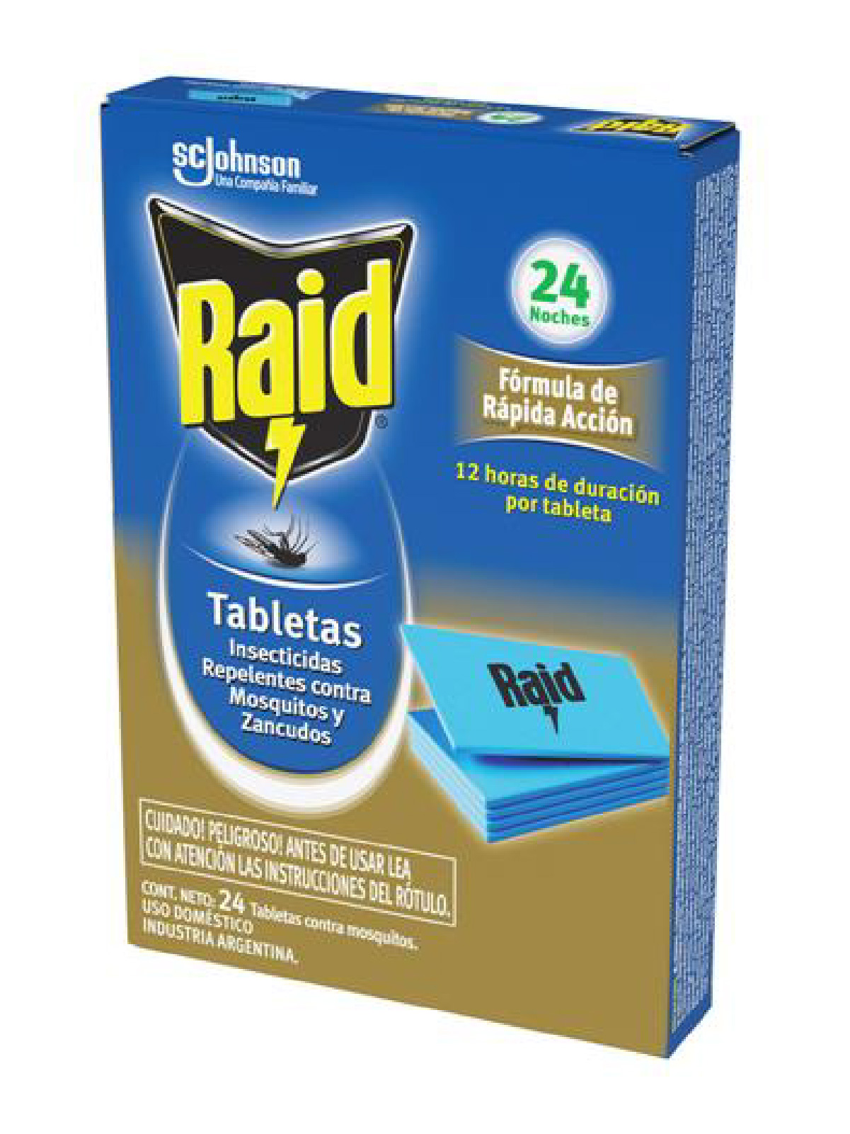
The idea
I worked on an existing brand and an existing pack, without modifying the original die-cut. The core idea was to lean on the identity the updated Raid products already had, so the tablets would rejoin the brand's visual universe instead of sitting there as an isolated product.
Before designing I researched both Raid and its direct and indirect competitors, and walked supermarkets to understand how these products behave on shelf: what they share, where the opportunity to differentiate sits, and how to make the tablets stand out from the rest.
The tablets had to rejoin the brand's visual universe instead of sitting there as an isolated product.
Development
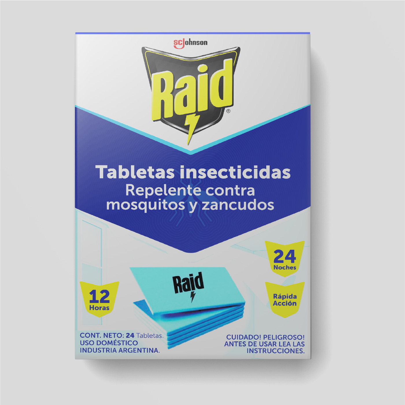
The final design combines cues taken directly from Raid's current identity with new ones, built to respect those same rules.
The project closed with actual production: delivering the pack printed and assembled, respecting the 8.4 × 12 × 2 cm die-cut and the digital print specifications used on the real product.
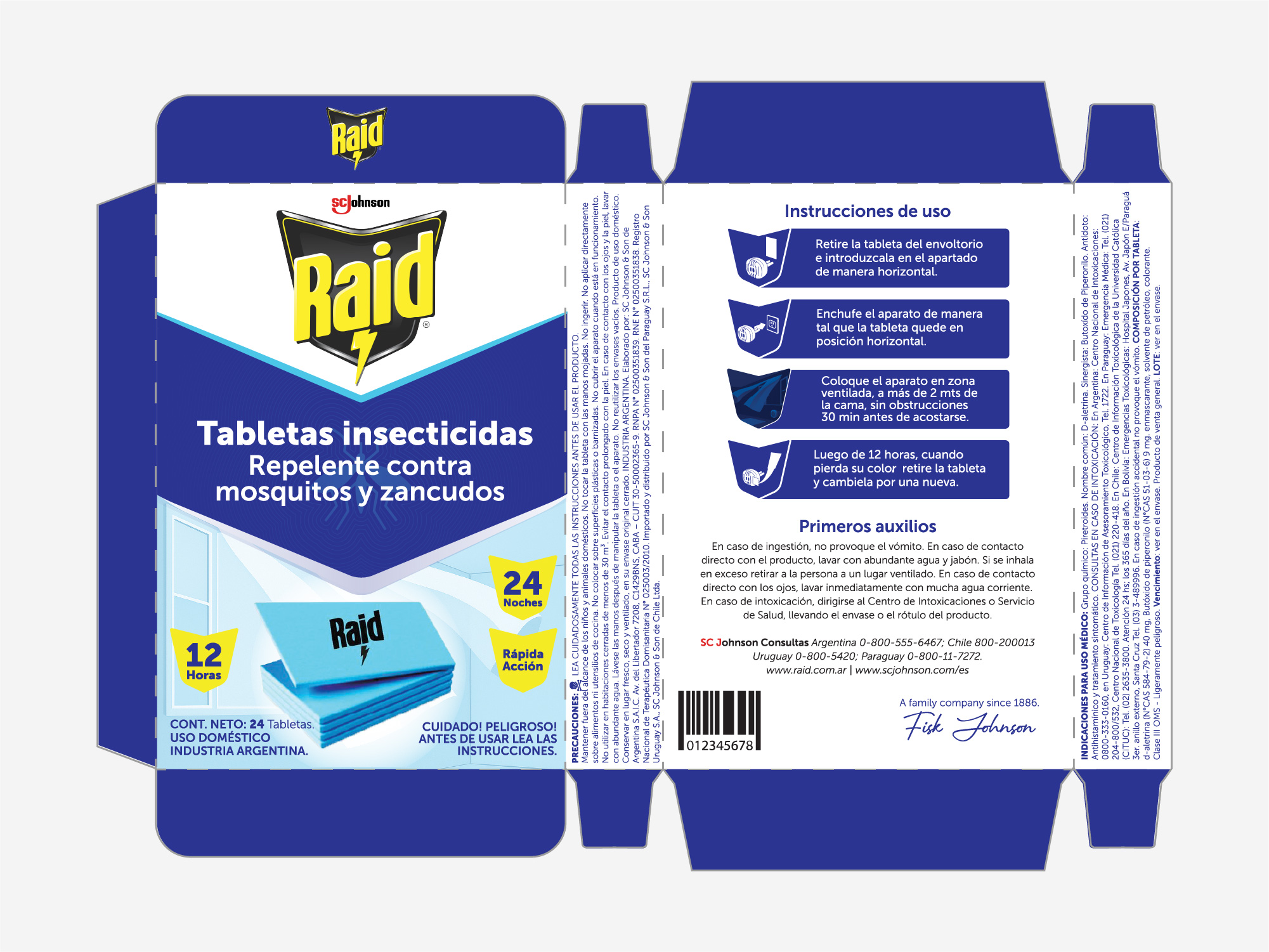
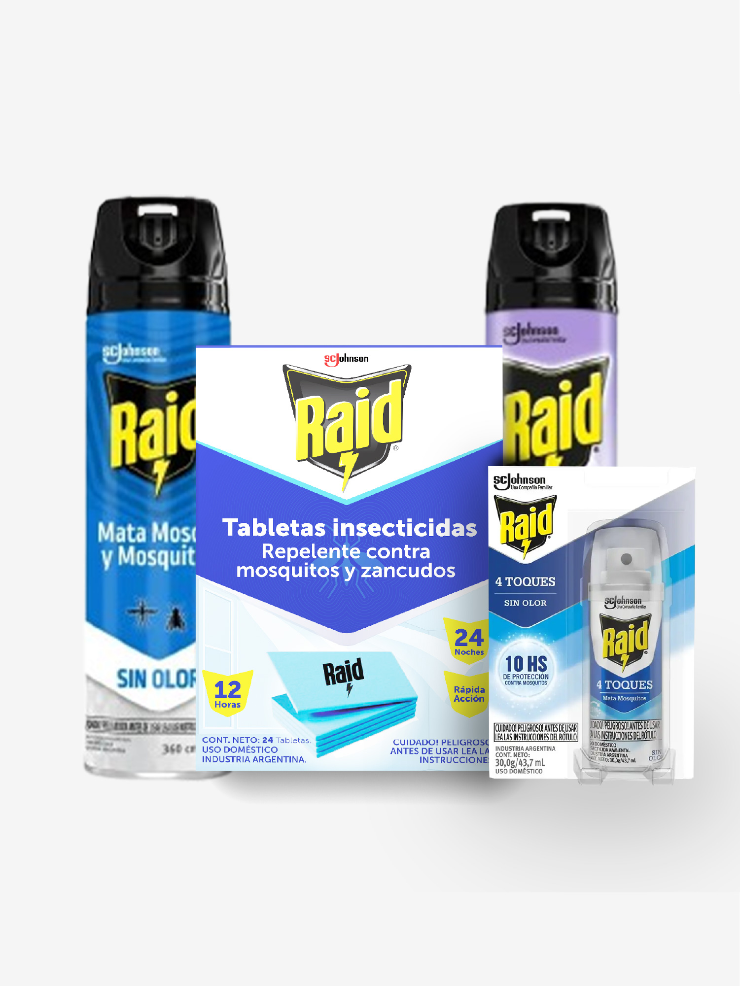
Not one new element. The blue, the diagonal and the shield all come from products the brand had already updated.
Applications
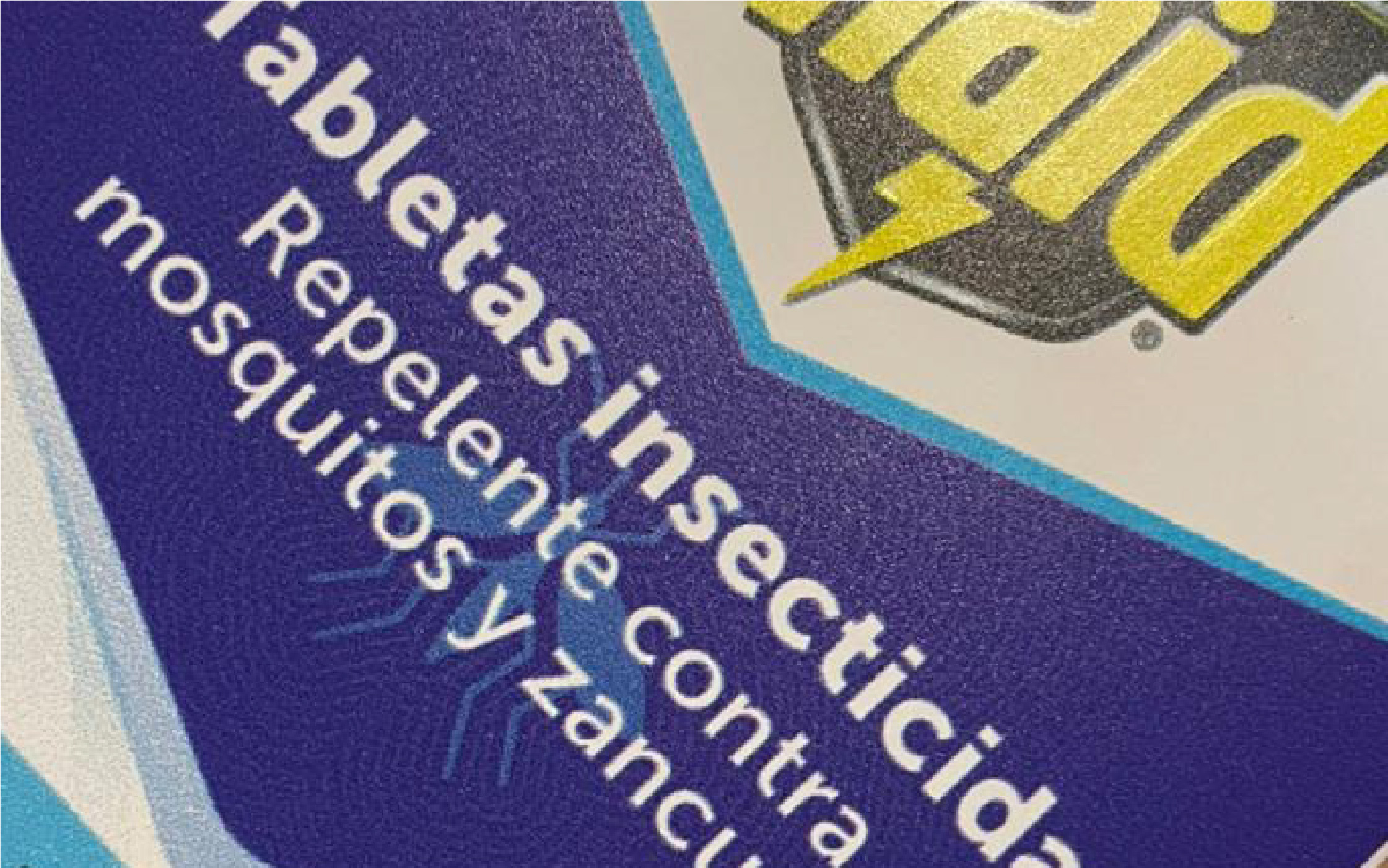
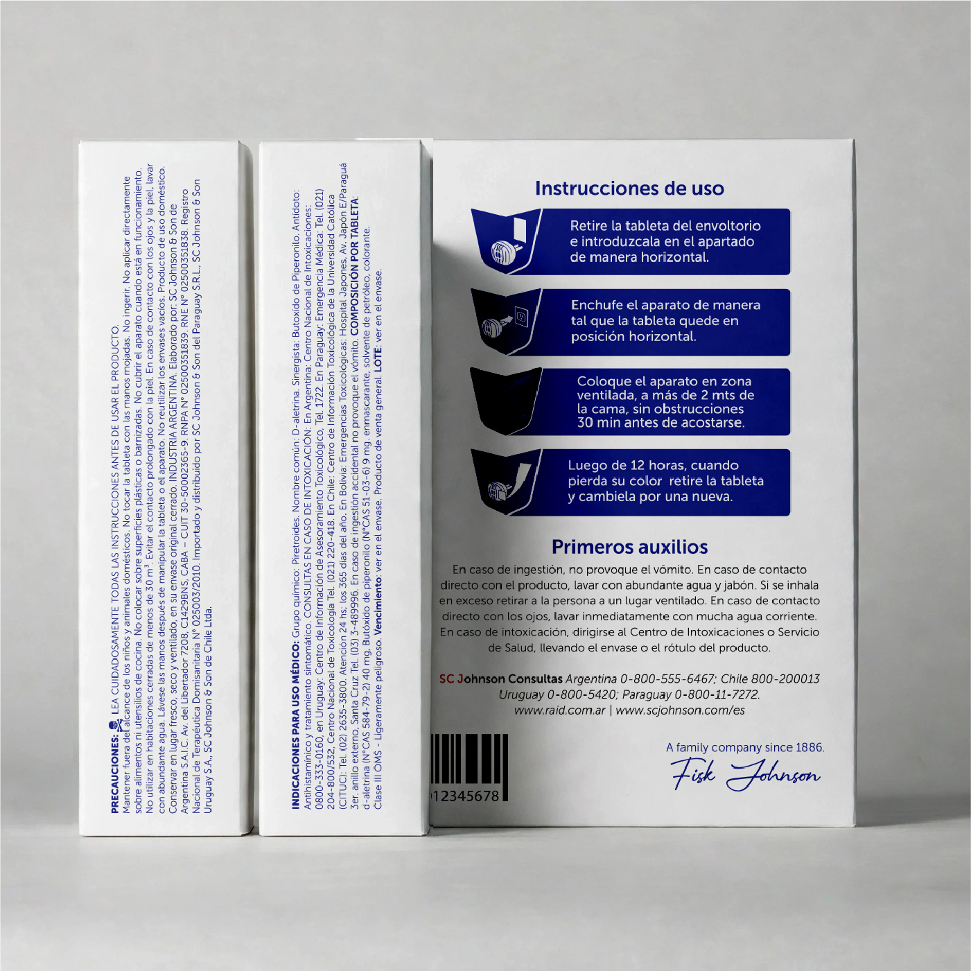
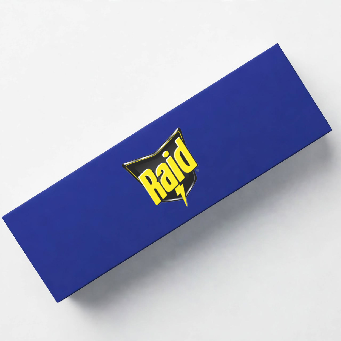
The brief required the piece delivered printed and assembled. This is what came out of the press.
Outcome
What I enjoyed most wasn't designing. It was going to look at the shelf.
Beyond a result that pleased both me and the faculty, what I take from it is the whole research process beforehand: walking supermarkets, observing competitors, working out which brand elements could be reused. The project started in supermarket aisles and ended with the printed piece on the table.